We are all Photographers

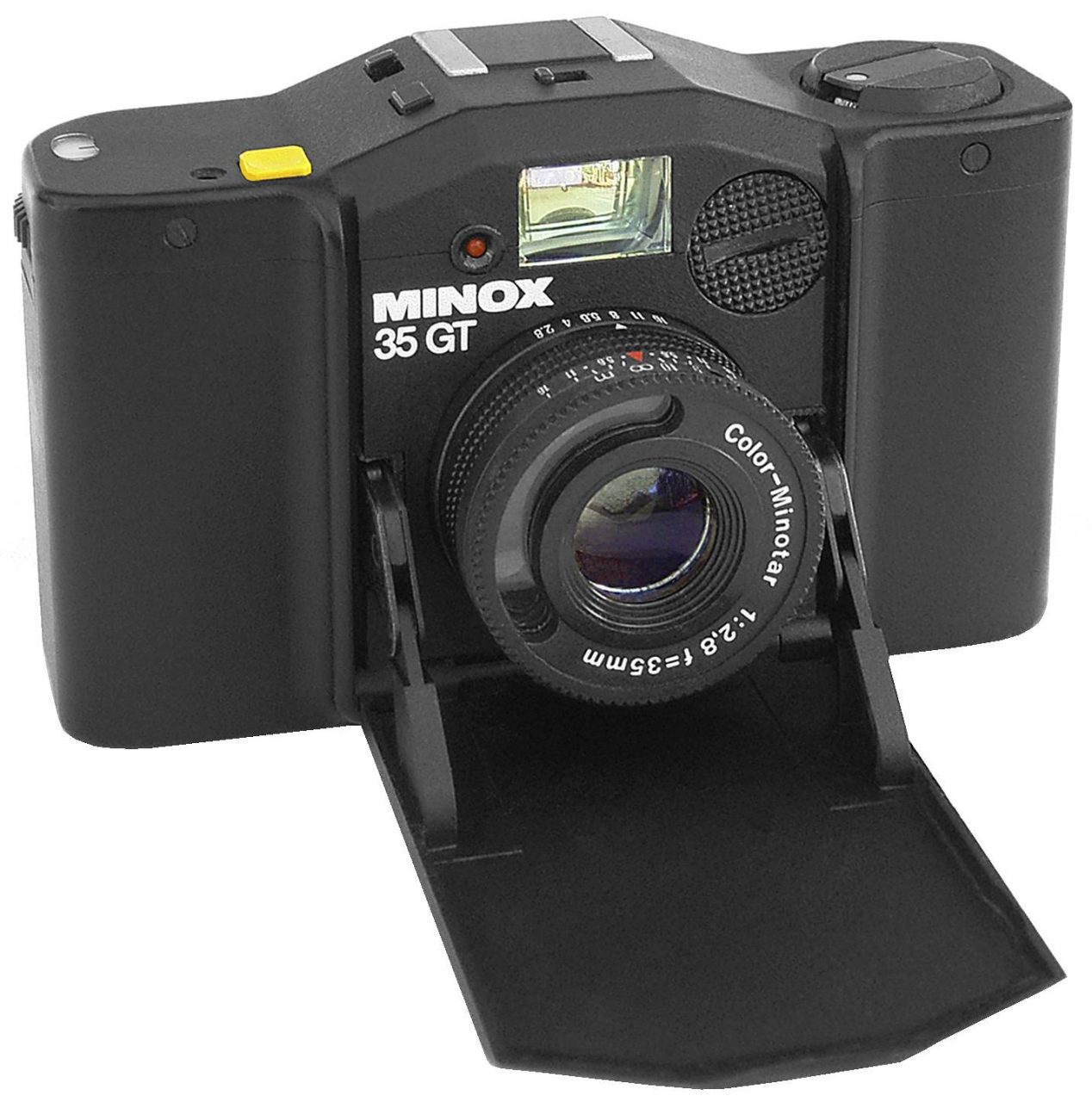
This is the camera, a Minox 35 GT from 1981, that I always carried with me for several years. It was tiny, only 100mm wide and 31mm deep when closed, it weighed just 200g, yet took standard 35mm film. It felt like a spy camera, I was always ready. In those days only professionals carried a camera 24/7, you were the exception.
Today it is no longer in production since it has been well superseded by the power and ease of use of our ubiquitous phone cameras. Yes, we are all photographers now and all those photographs are free at the point of use. How times change, how quickly advanced technology becomes redundant.

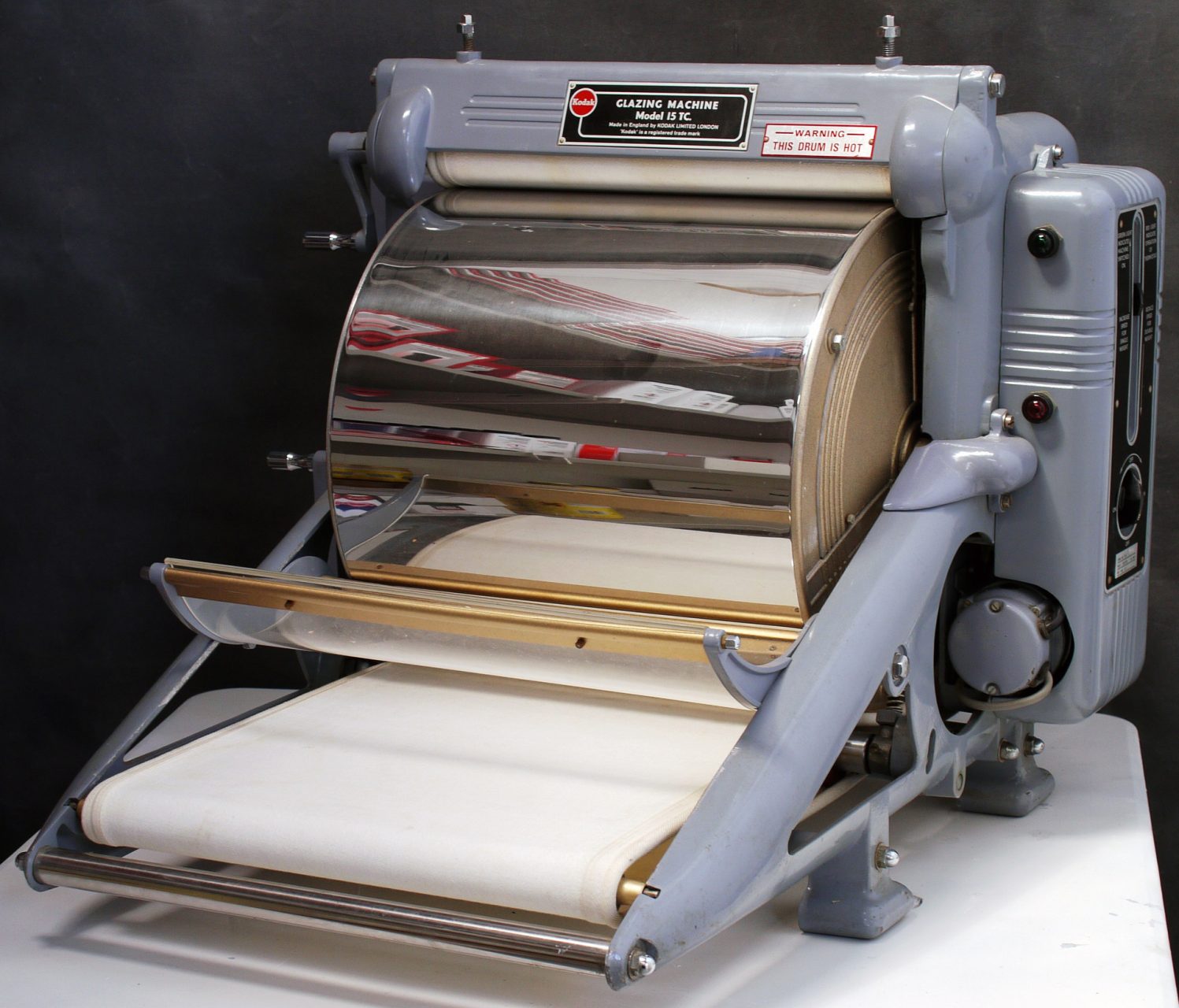
In the 80s to become a photographer you had first to build a darkroom. That was the only way to process film fast enough to be of commercial use, without spending a fortune on poor quality rush processing. So it took maybe an hour to process film and then maybe a couple of hours to make prints, and that was with a film drier and a Kodak drum print drier. Remember this was just for monochrome. Every click cost money, many jobs would be completed on just 1 roll of film, that is 36 pictures on 35mm or 12 on 120 format. Nowadays I may take 500 pictures or more, there are so many more decisive moments these days! And they are all free…

Kodak Glazing Machine and Print Drier

The fastest film available was normally Kodak Tri-X or Ilford HP5 at 400 ASA, often push processed to 800 ASA. There was Kodak Recording film at 1250 ASA, which had an enjoyably coarse grain, but that meant it was reserved for specialist uses. I was also an early adopter of Ilford XP1 400, a chromogenic C41 35mm film with its own specialist developer. It had so little grain and such good gradation, that art directors and picture editors thought I was using medium format, so I loved it.
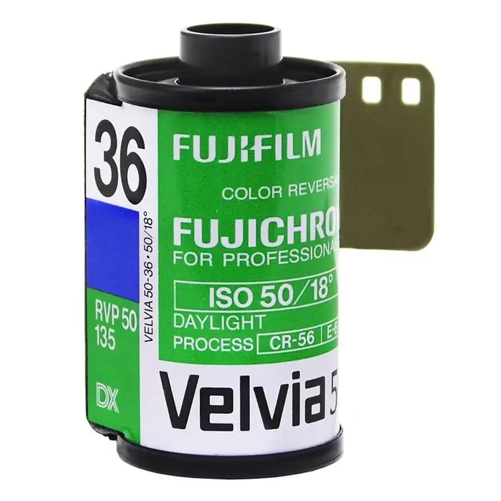
As for colour, I adopted transparency film, which had a fast turnaround time of 2 hours at a good E6 processor like Primary Colour. Of course the transparency, once mounted, was the final product ready for production, there were no negatives or prints. As a result the initial exposure had to be spot on, often bracketing of exposures was necessary. Alternatively you could get a clip test for the first few frames of the roll, and then order the development to be adjusted as you required. Good colour film was always slow and the best was Fuji Velvia which was only 50 ASA. Hence I often had to use a big hammerhead Metz 45 flashgun when out on location. Most transparency films above 100 ASA looked washed out, compared with Velvia or Fuji RDP 100. A particular issue for me was tungsten balanced film (3200K) for use at concerts. The only real choice was Kodak Ektachrome 320T, but I never liked it much. Otherwise there was Fuji 64T, excellent on a long exposure, using a tripod at night.

So the days of worrying about ASA, colour balance or even exposure are over. Photography sure has become easier, if not child’s play. Take a RAW format photograph and all those variables can be adjusted, no accuracy is required. The dynamic range of a good digital camera far exceeds film, an exposure 5 stops out can be recovered in Lightroom or Capture One, any colour balance may be used, and digital photos can now look great at 3200 ASA. My Minolta Flash light Meter IV is totally redundant, as are most of my photographic skills. Yes we are all photographers now…

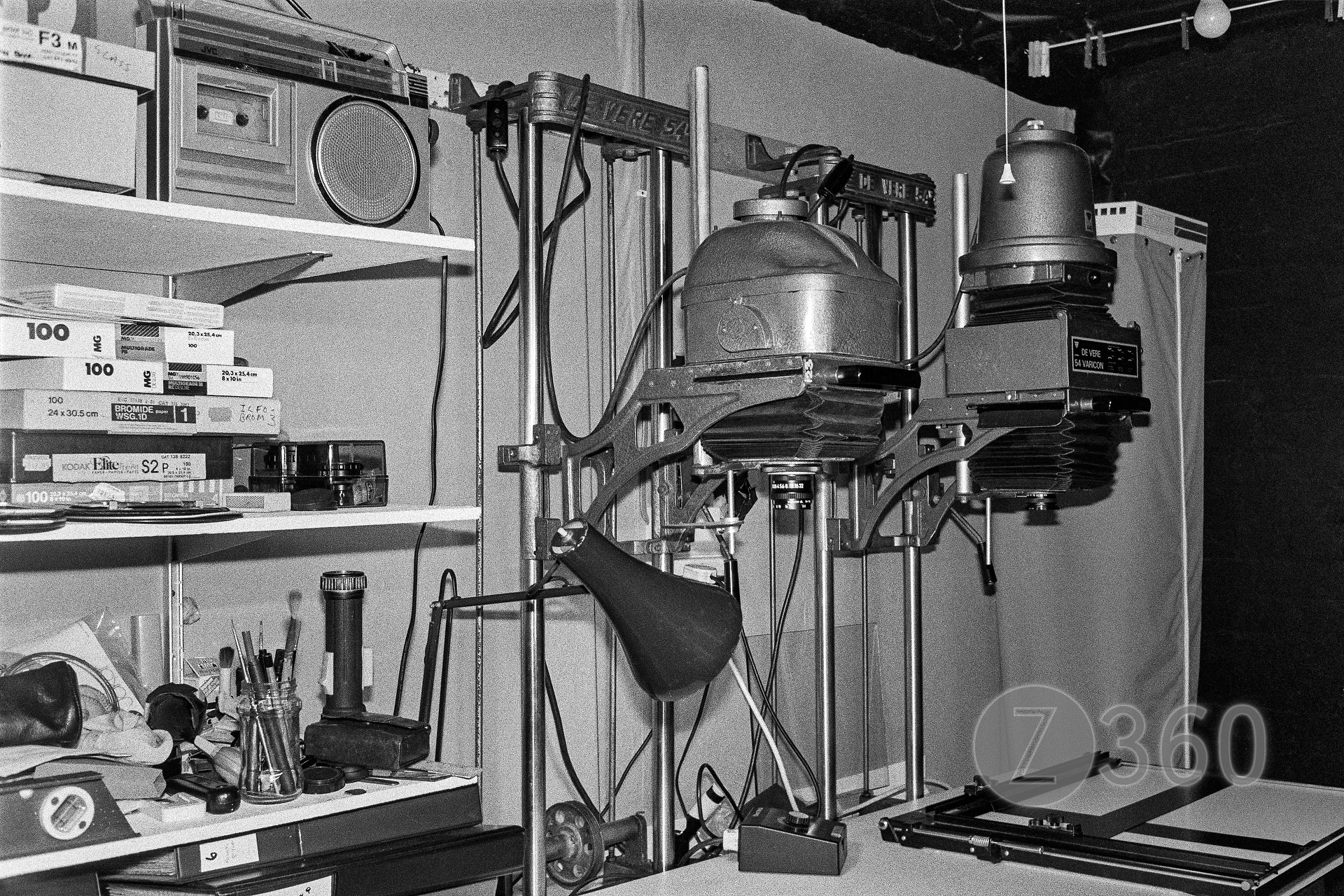
De Vere 54 enlargers, with cold cathode and condenser heads, in my darkroom c.1985

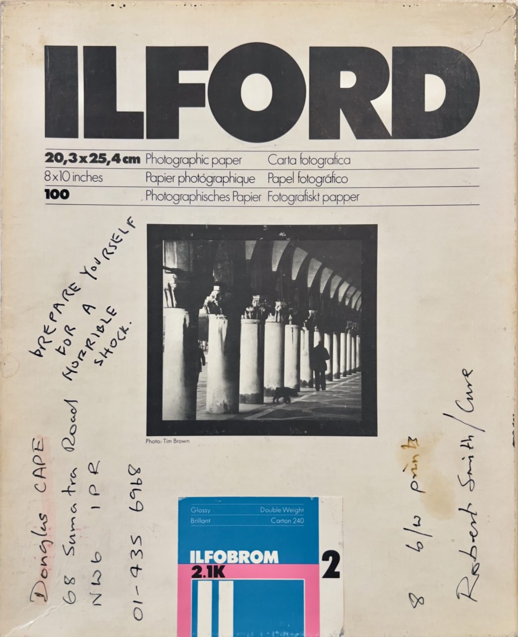
Prepare yourself for a horrible shock

Or Why I punched the Wardrobe

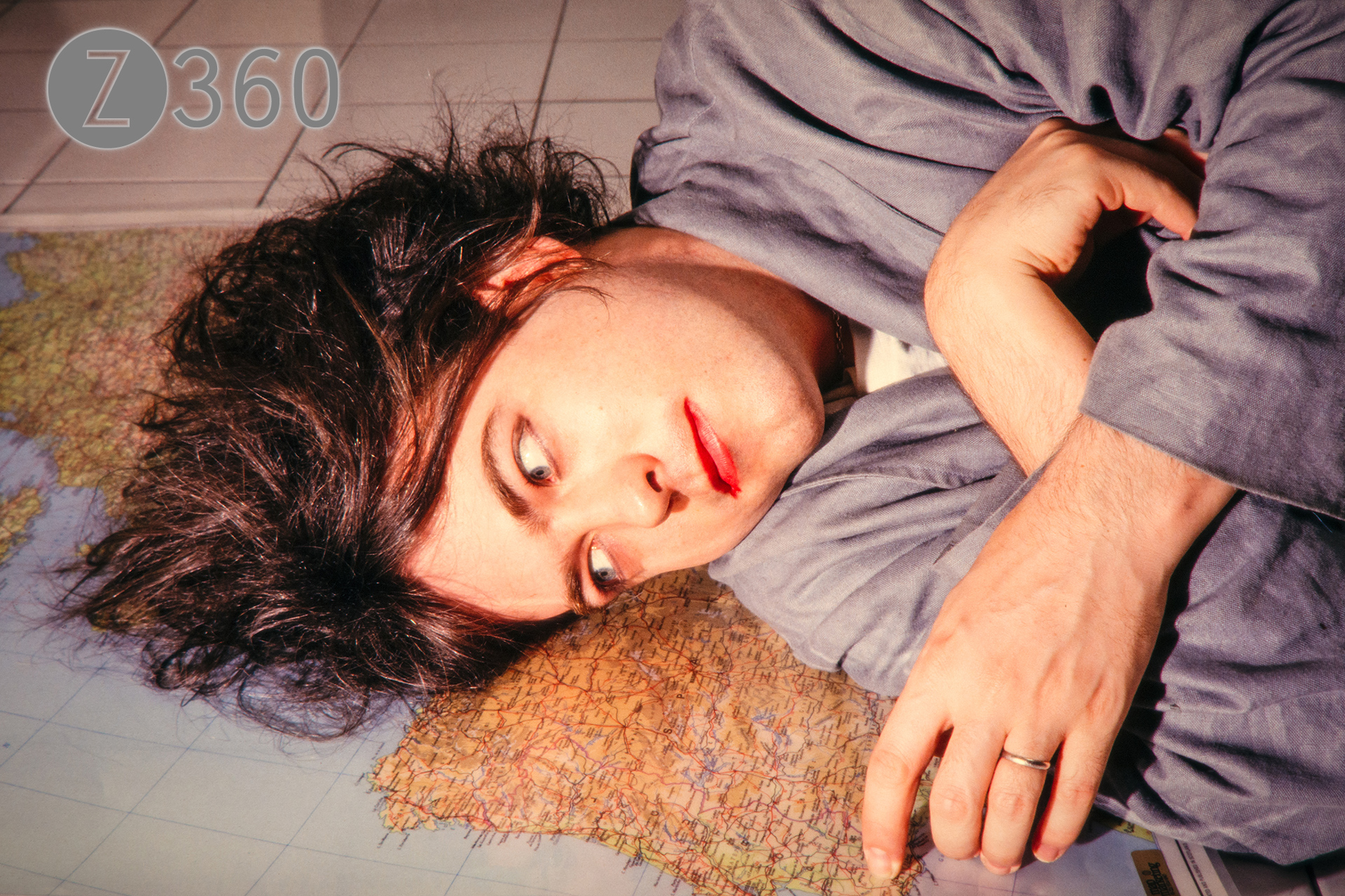
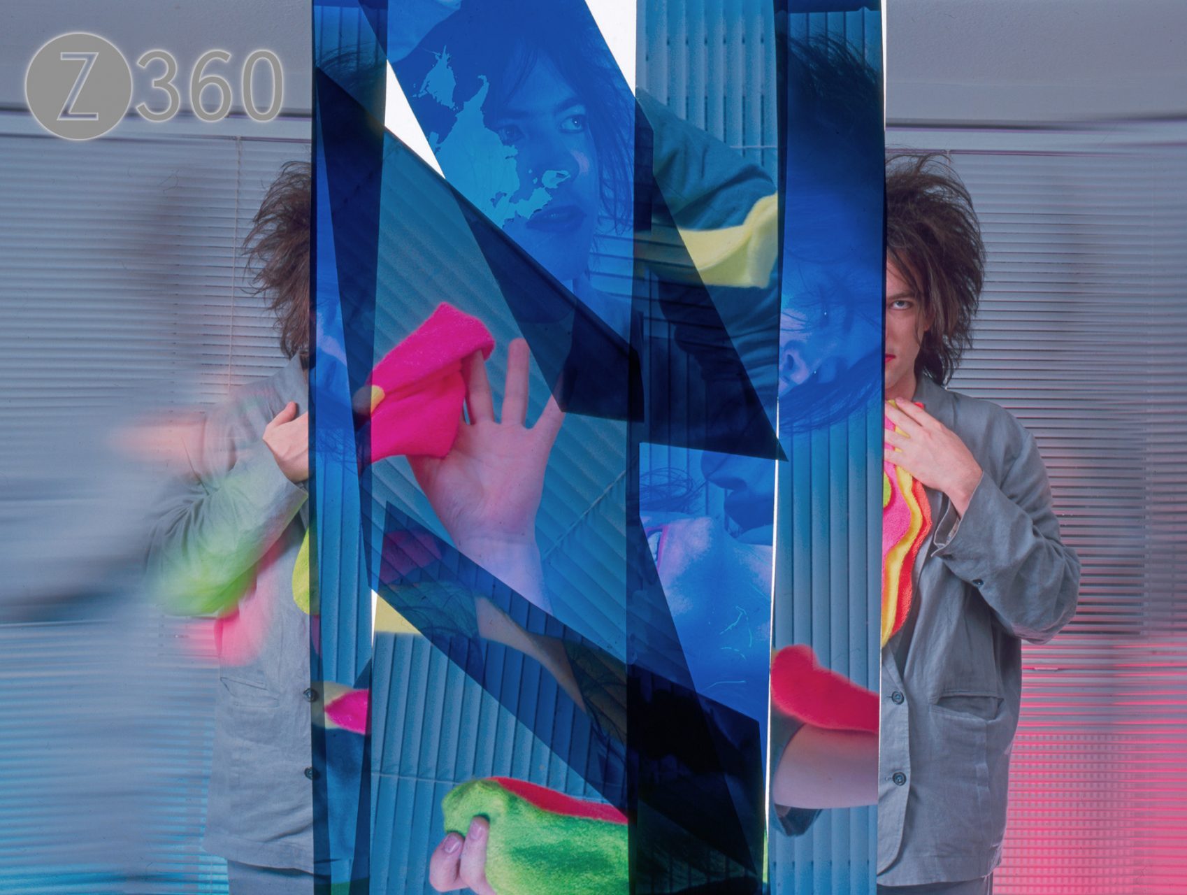
In 1985 I photographed Robert Smith of The Cure at his record company offices in Marylebone, London for Sounds. He was a sweetie, and all seemed to go well. However, for the first time ever (for me at least) the photos were taken “on approval”. This procedure was totally antithetical to the way I worked and to what I believed being a photographer was. However the photos were intended for the front cover, so I thought fine, no problem. It did mean I had to hurry more than usual and to make a presentation box. In order to protect the fragile original Hasselblad transparencies I mounted them in expensive glass 2.25” slide mounts. There was no time to make costly duplicate medium format transparencies. The black and white prints were proofs and not the intended final master prints.

Yes it was horrible

Well I guess the story can be told now. To keep it simple this is what happened – he destroyed the photographs he liked. That is THE WRONG ONES. When I say destroyed I mean he smashed the glass of the slide mounts and then proceeded to cut up the unique and original transparencies into tiny shards. I received in return a box of broken glass and slivers of cut-up film. Since the photographs were for the front cover, these were the best ones, the colour transparencies. Sounds magazine was not interested in shreds of film for their cover at the time. Nor did the magazine, record company and PR organisation wish to make their pop star appear really stupid, so there was a big hush-up.

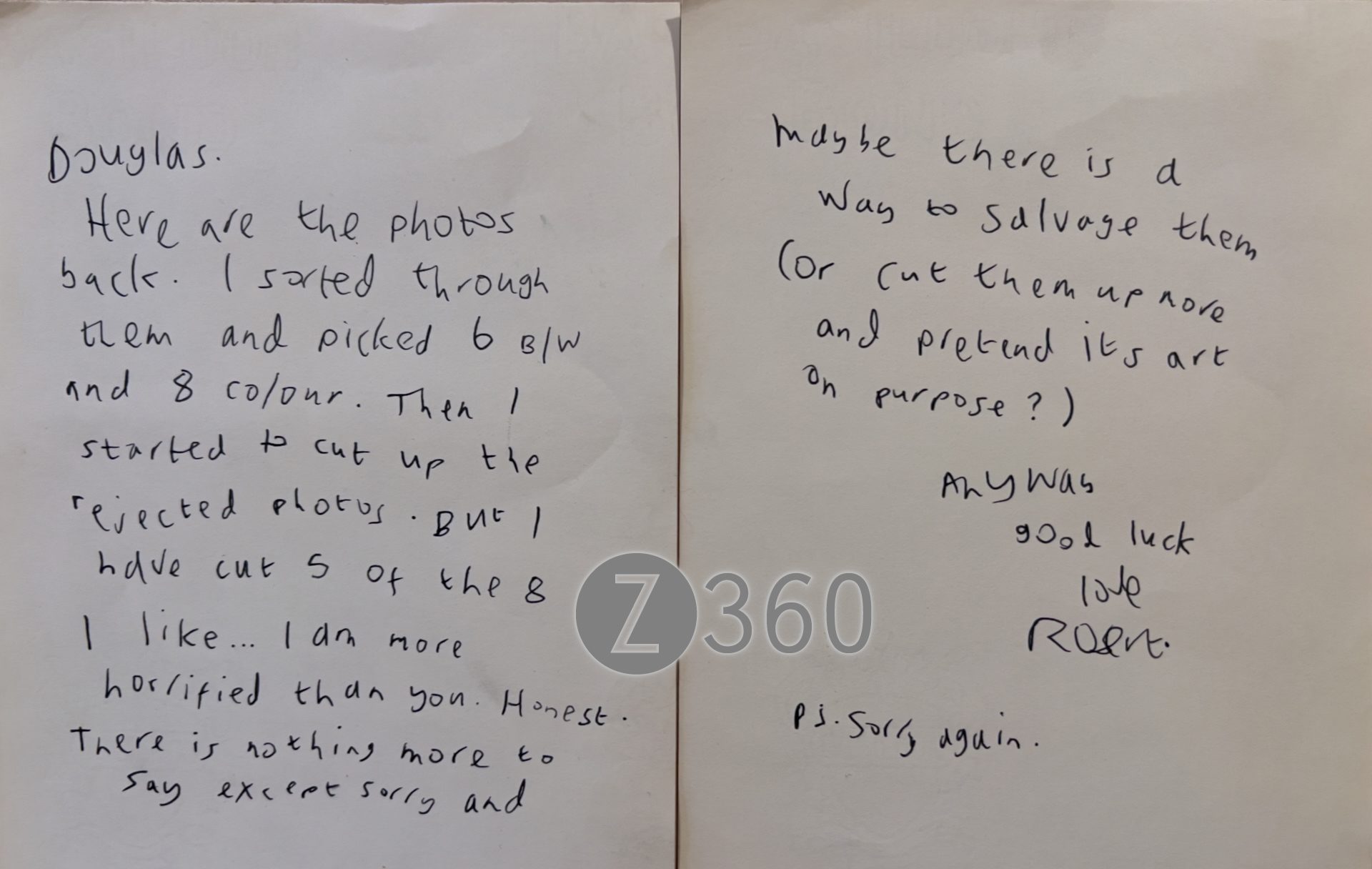
Robert himself was horrified…

I was remarkably angry and punched a wardrobe much too hard. I could see which way the wind was blowing in the celebrity industry and soon changed my style from portrait to commercial studio photography of inanimate objects. At the end of the day a perfunctory sum was paid in recompense, months later. To me that was not the point at all, I had missed doing the cover photo and everybody seemed to think it was somehow my fault. I guess it’s all down to the pecking order, but no-one has the right to destroy someone else’s original work.

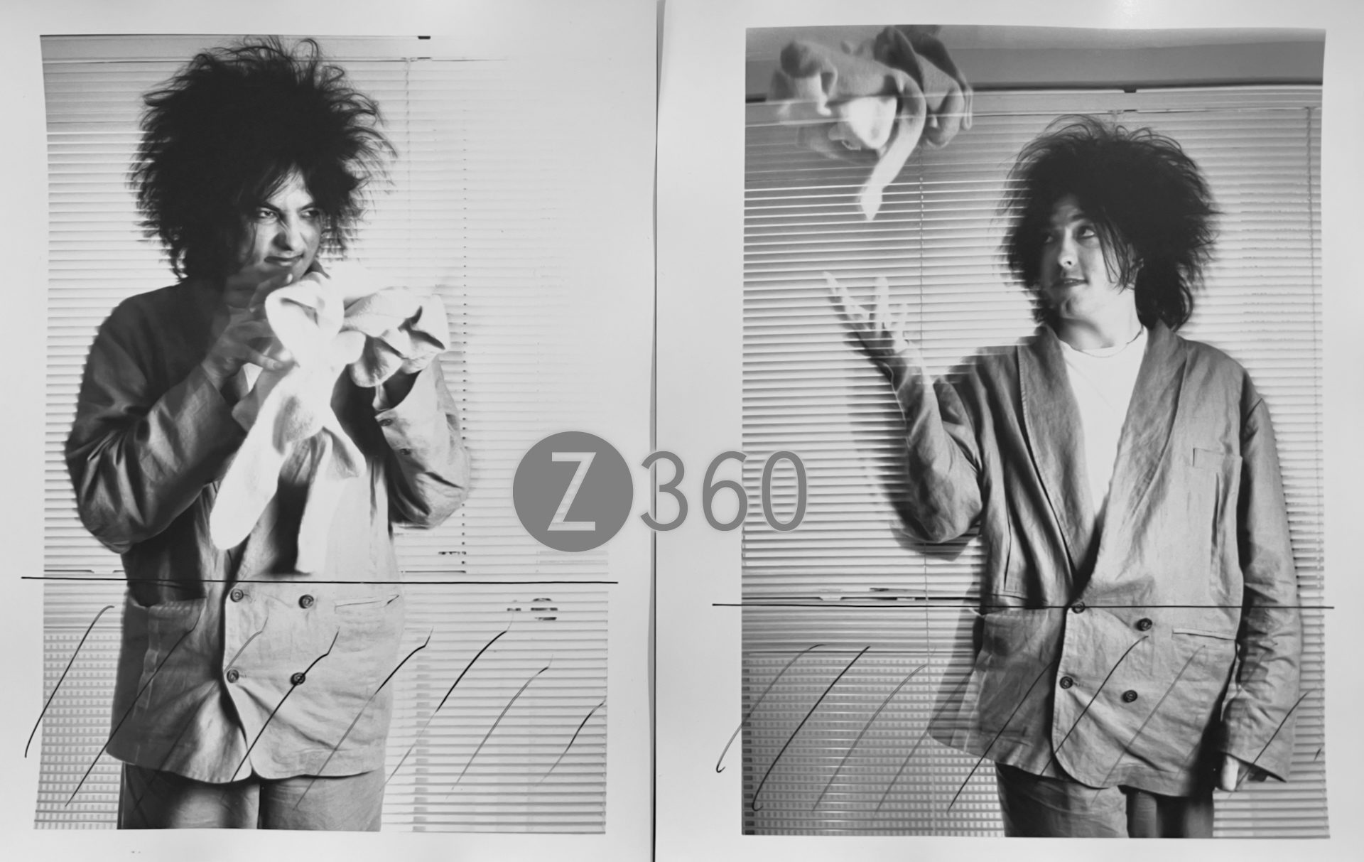
Cropping suggestions from Robert

In those pre-digital days there were no scanners or any easy way to use the shards of film I was left with. Now 37 years later I have relaxed enough to open up this can of worms and follow Robert’s advice. Yes here is the cut-up he suggested making all those years ago. It might be “art on purpose” but it’s certainly not a Sounds cover.

Yes I was using a filter for that edge effect

Z360 goes mirrorless

NikonZ7

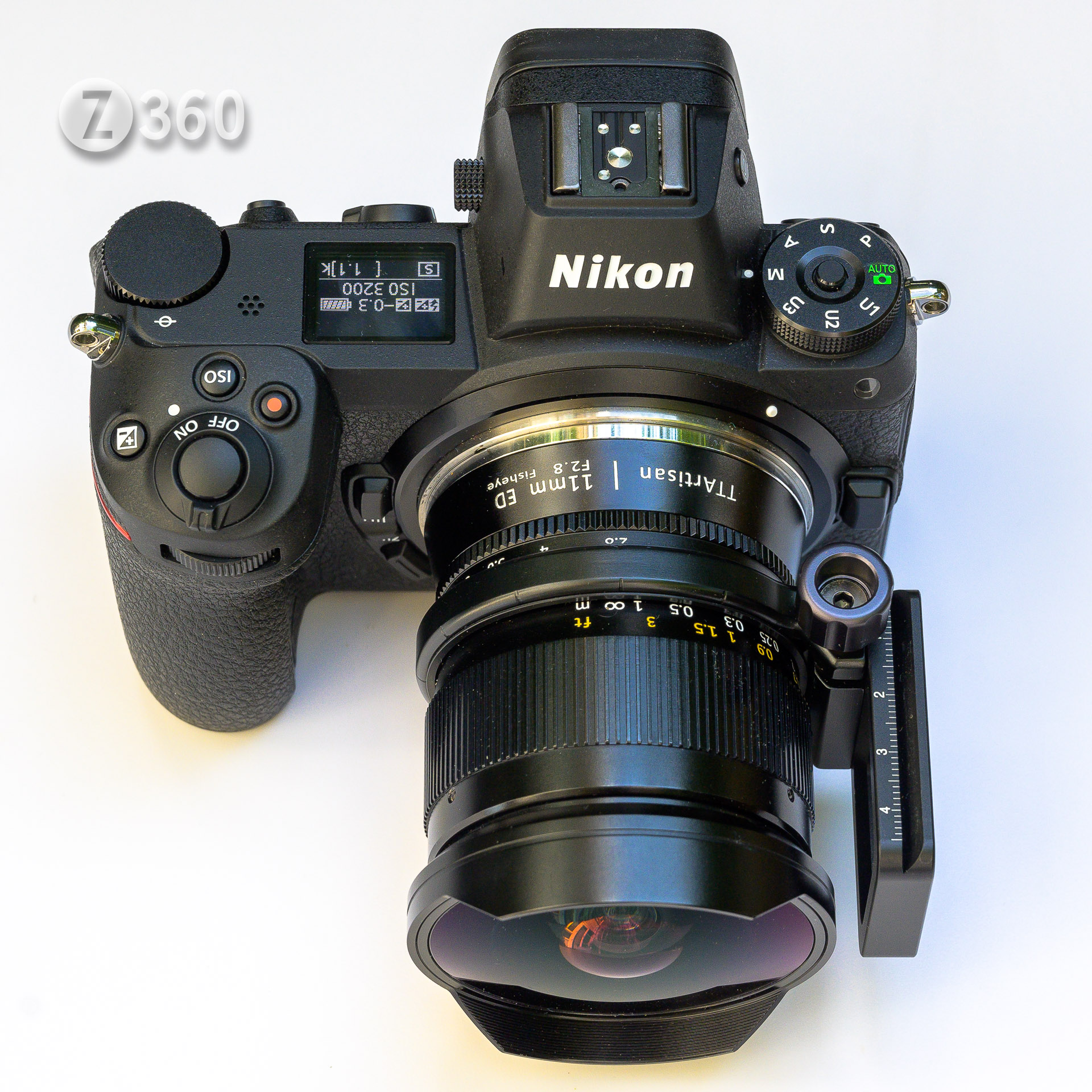
Nikon Z7 with TTArtisan 11mm f2.8 Fisheye and Nodal Ninja Lens Ring for Panoramas

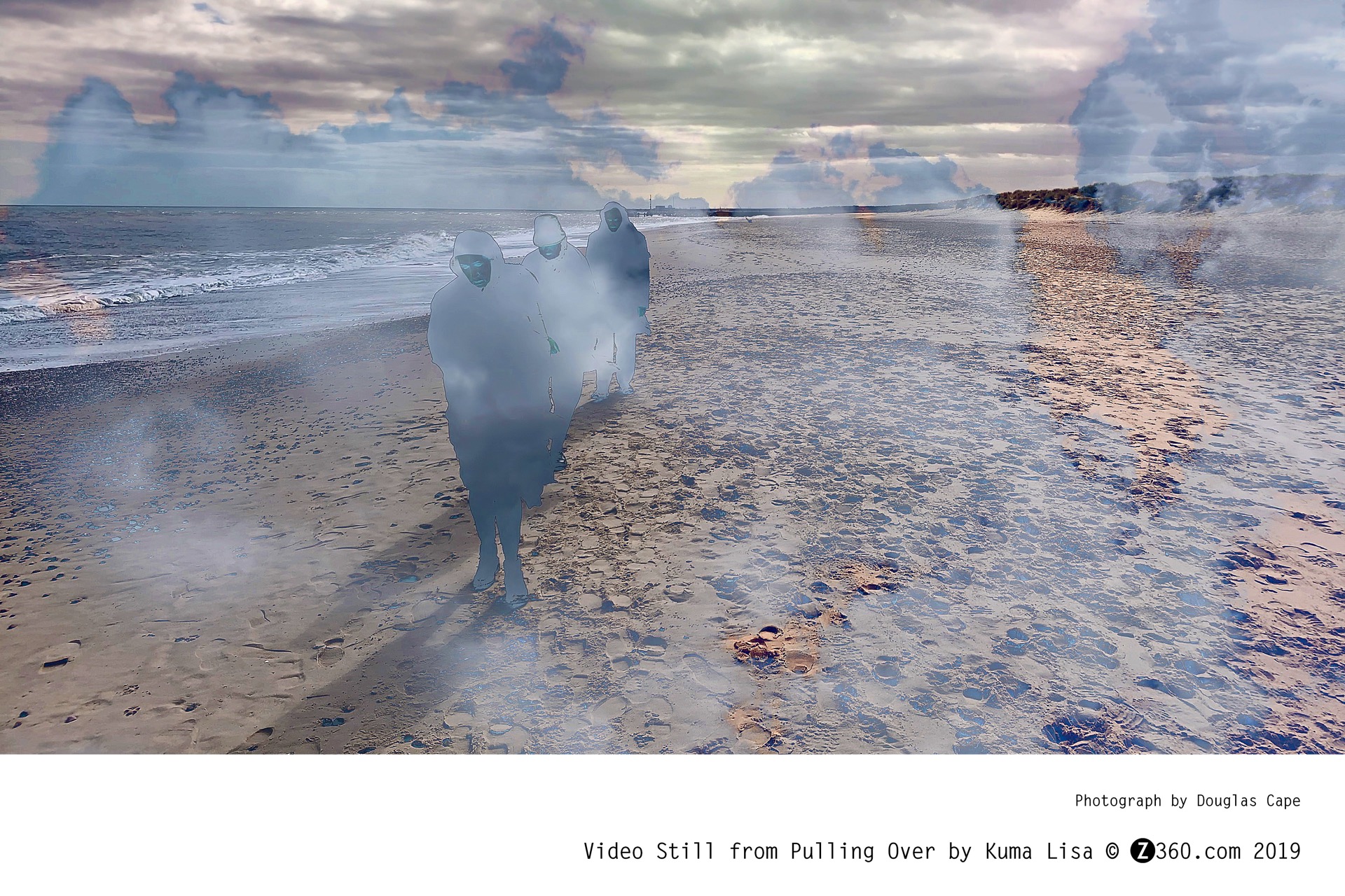
So what are the advantages you may ask. Quite simply the most important reason for me was to have access to 4K video, so that my cameras could compete with my iPhone. Now that I have a Nikon Z7 and Z50 I have found a plethora of other reasons for the upgrade. When I saw the the power of 4K video on my iPhone XS  , it was apparent my old Nikon D800 was simply outclassed by the new computational video options in my iPhone.

Xmas_pulling_over

Still from iPhone 4K video – who needs SLR cameras?

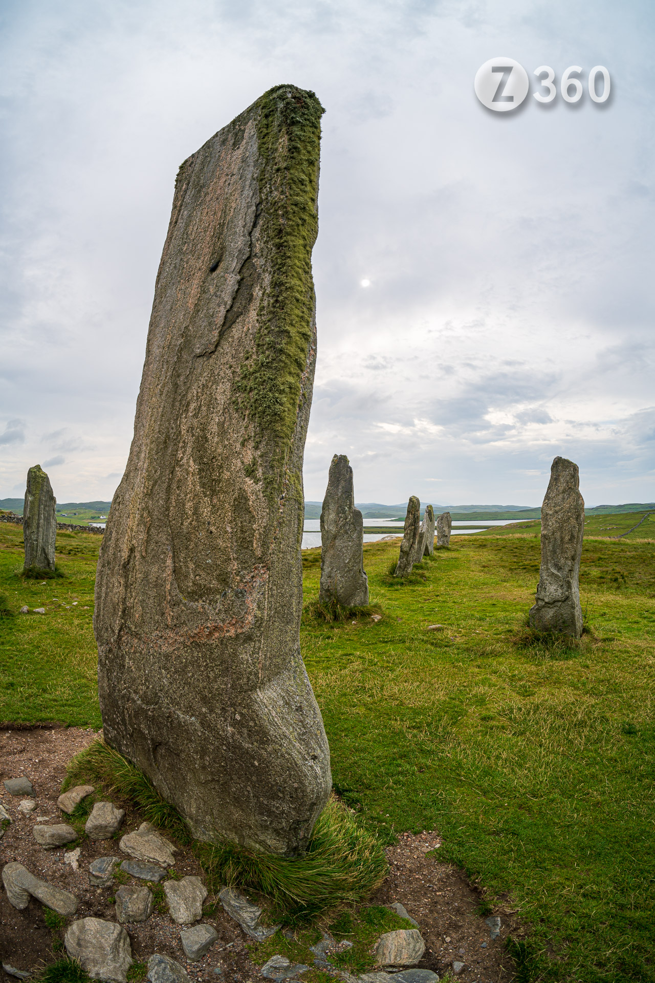
 However this iPhone has only one usable lens (the telephoto is lower quality, although I hear they have improved), and I found this very limiting. Now I have access to lenses from 7.5mm to 500mm, lots of options. Not only that, but due to the short flange distance, many vintage lenses can now be easily used with an adaptor. Talking of adaptors, the Nikon FTZ adaptor for G lenses works very well retaining full AF. However it is very bulky with a large box sticking out below the camera, which I find quite annoying, both for tripod and handheld use. (Update: There is now a version without the large bump). If you are using an old lens without AF, I recommend using a dumb circular adaptor. As for Z lenses, the new Nikon S lenses are indeed of spectacular quality, if rather expensive. Much better value and more entertaining are the third party Chinese lenses from Pergear, TTAritisan, 7 Artisans, Laowa and Meike among others. I have bought several of these metal manual focus lenses, in particularly fisheyes and wide angles, and optically they are excellent performers. In particularly my TTArtisan 11mm f2.8 fisheye was a lot sharper than my old faithful, the Nikon 16mm f2.8 fisheye, much to my surprise. The edge performance was a league above, although 11mm seems a misnomer, having a nearly identical 180º field of view to the Nikon 16mm. There are now some Chinese AF lenses from Viltrox, at least half the price of the Nikons, which have been well reviewed.

callanish

Callanish monolith Stone c.2600BC, Isle of Lewis. Nikon Z7 with TTArtisan 11mm f2.8 Fisheye.

 So much for the lenses, the real surprise was actual usage. For 30 years I have only used my cameras in full manual, locked ISO, spinning the speed and aperture dials as necessary. Now I have discovered the power of Auto ISO (still available in Manual), and am already getting lazy. With the power of dual gain sensors it does not make much difference to noise and quality when shooting in Raw whether the ISO is 100 or 10000. I am aware that for full quality I should be below ISO 400, but can you tell the difference? Anyway the speed of use, once fully set up, allows me to nearly shoot at random. The amount of information in the electronic viewfinder (which takes some getting used to) is highly informative and can be rapidly changed. The peaking function is invaluable for manual lenses. I trust the AF and exposure (-1/3) and of course all the pictures are now free.The latest sensors are amazing, I remember never shooting above ISO 800 on my Nikon D200. Meanwhile these cameras are truly optimised for video, the focus no longer jumps or hunts, aperture changes proceed as if click-less, even changing shutter speed is done smoothly. In addition you have the speed and flexibility of a touch screen, articulated monitor and best of all, silence. A minor annoyance are touch buttons on the Z50 monitor, often accidentally touched by my nose since I am left eye dominant. They have moved them on the similar spec Nikon Zfc. The autofocus is great, with a few confusing options, wide area-s seems to suit me. Mirrorless cameras tend to use more battery and require attention since while the camera is on the monitor is on, which has caught me out a few times. Always switch off when not using and it easily takes hundreds of shots and an hour of video (with a restart). One advantage is that they can be recharged via USB without the mains adaptor.

 In conclusion everything feels quiet, smooth and light, that’s all good. Do they take better photos than my old D800? Perhaps, but the benefit is really apparent in the sparkling video, tracking autofocus and flexibility of use.

Bargain Pro Cameras

FX Lenses on DX Cameras

Article featured in Nikon Rumors June 15th 2019
Comments included:
– That’s a very good article. If a D5xxx works for you, that’s great. 
– This is a good article for enthusiasts to read and feel confident they are justified in buying and enjoying a DX system.

_1D82785

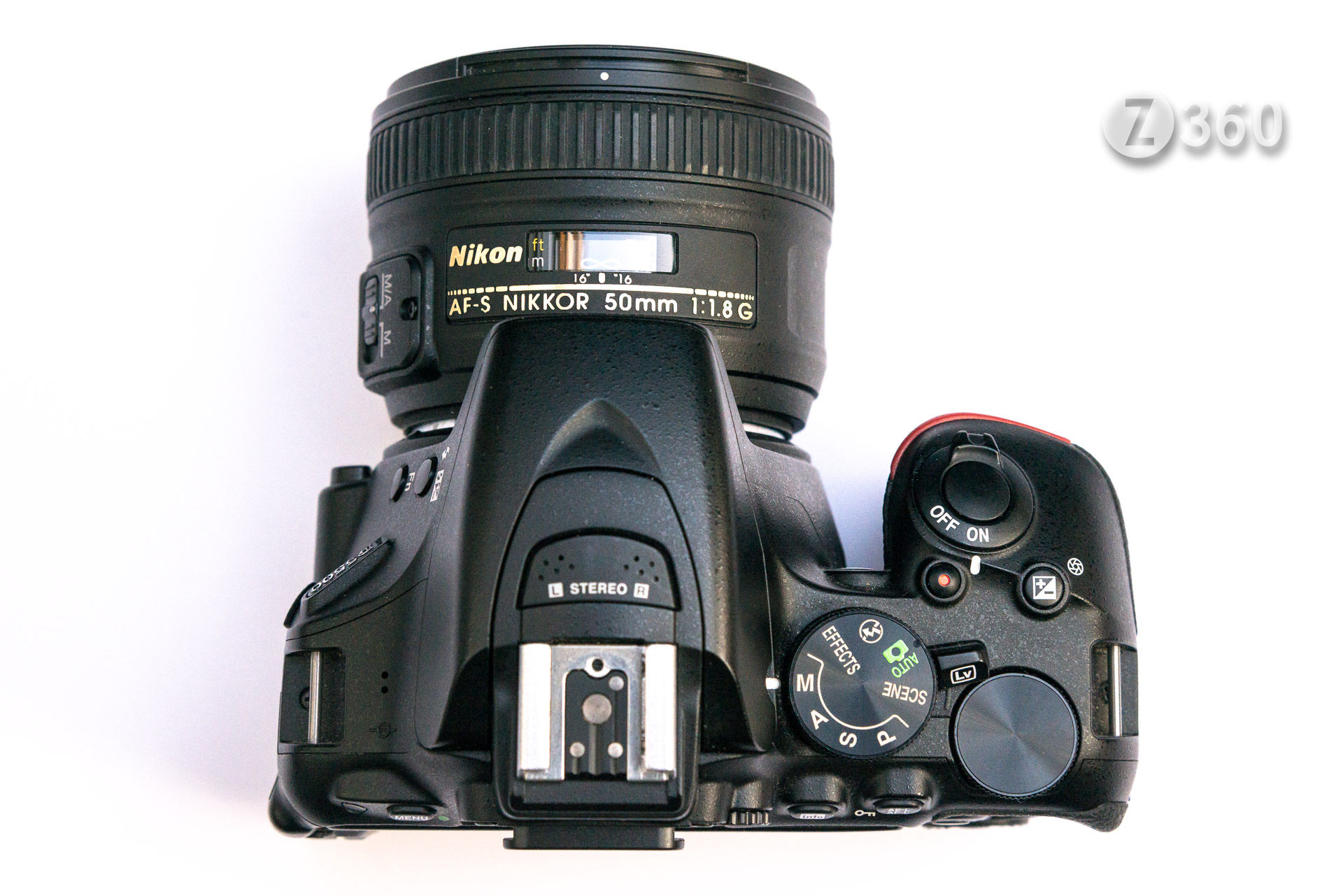
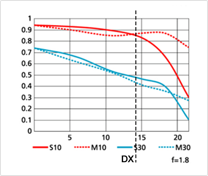
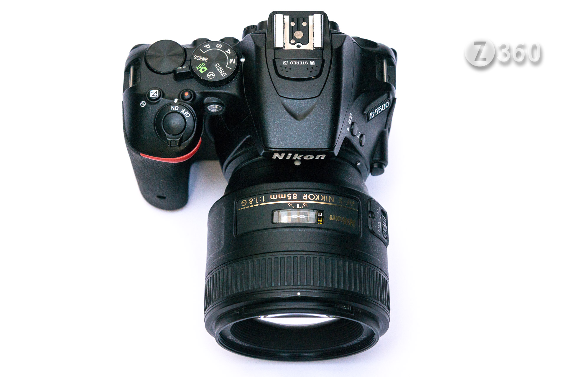
I am often asked for camera recommendations and my standard reply is the Nikon D5500. The later D5600 is basically the same camera with Snapbridge (an app for phones), which I never use. To make this into a “Pro“ camera I suggest attaching some some full frame FX lenses, which will give you startling sharpness, very little vignetting and no corner fuzziness. You are just using the best part of the lens, which is basically over-engineered for usage on DX crop sensor cameras. Take a look at nearly all MTF charts and you are avoiding the wavy (not as sharp) part of the graph on the right hand side, which is the edge of the sensor.

50mm-f18-g-mtfDX

Here is the Nikon MTF Chart for their AF-S Nikkor 50mm f/1.8G full frame lens.
On a DX camera you are only using the lens up to the vertical dotted line.

A note about terminology. 
A DX or APS-C camera is a so called crop sensor camera, meaning the the sensor is 1.5x smaller than a full frame FX camera. The sensor in a full frame camera is 24x36mm, the same as classic 35mm film. Thus on a crop DX camera the standard 50mm lens becomes a 75mm lens (50×1.5=75), a short telephoto. DX lenses cannot normally be used on full frame FX cameras, the image does not cover the whole sensor. On a DX camera a standard lens would be a 35mm, giving roughly the same angle of view as a 50mm lens on full frame. The Nikon 18-55mm DX kit lens is equivalent to a 27-82mm full frame lens.
The sensor in the D5500 is 24.2 mega-pixels, which is the same resolution as many full frame cameras such as the Nikon Z6 or D750 and the Sony A7.

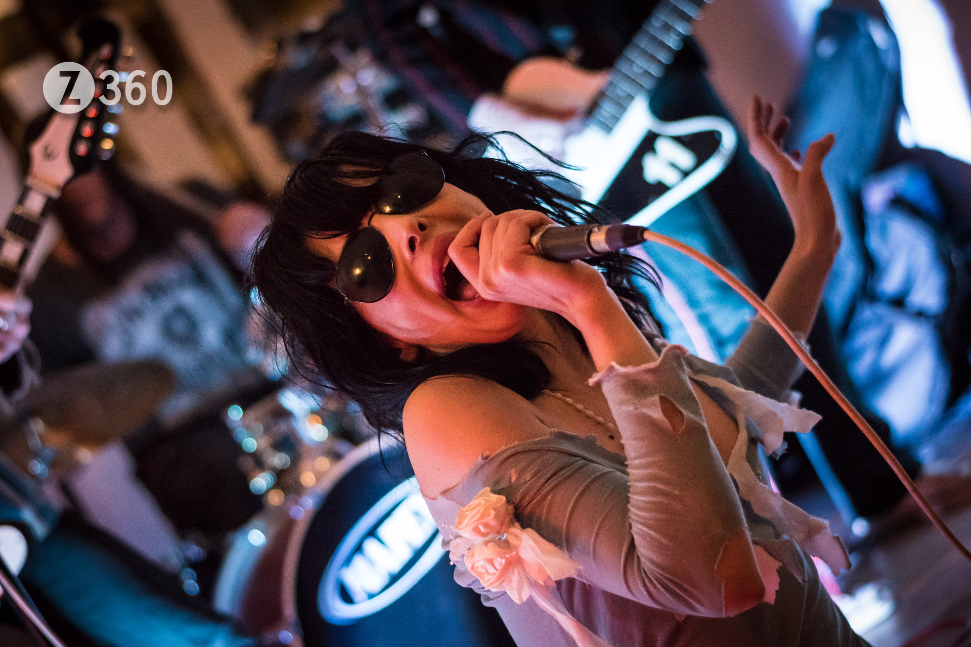
Starsha Lee at Flaxon Ptootch

Starsha Lee at Flaxon Ptootch, Kentish Town
AF-S NIKKOR 50mm f/1.8G – 1/250sec, f2.0, ISO3200

My favourite lens combination in this regard is the AF-S Nikkor 50mm f/1.8G. You might think a full frame lens would be too big on a DX camera, but it fits perfectly in the hand and weighs less (185g) than the 35mm DX f1.8 lens (200g), specifically made for crop sensor cameras. Best of all it does not look like a telephoto lens, has well recessed glass and focuses down to to 0.45m, very good for a 75mm lens. It is no wonder Nikon do not make a DX 50mm lens, it would be pointless to try and improve on this. In crowded social situations this focal length is ideal for picking out faces in the melee, and is several centimetres shorter than the kit zoom lens which is only f5.6 at 50mm. Indoors with average room lighting that will never be fast enough even at ISO 3200, and of course you lose the the 3D effect of an f1.8 lens.

_DC53300

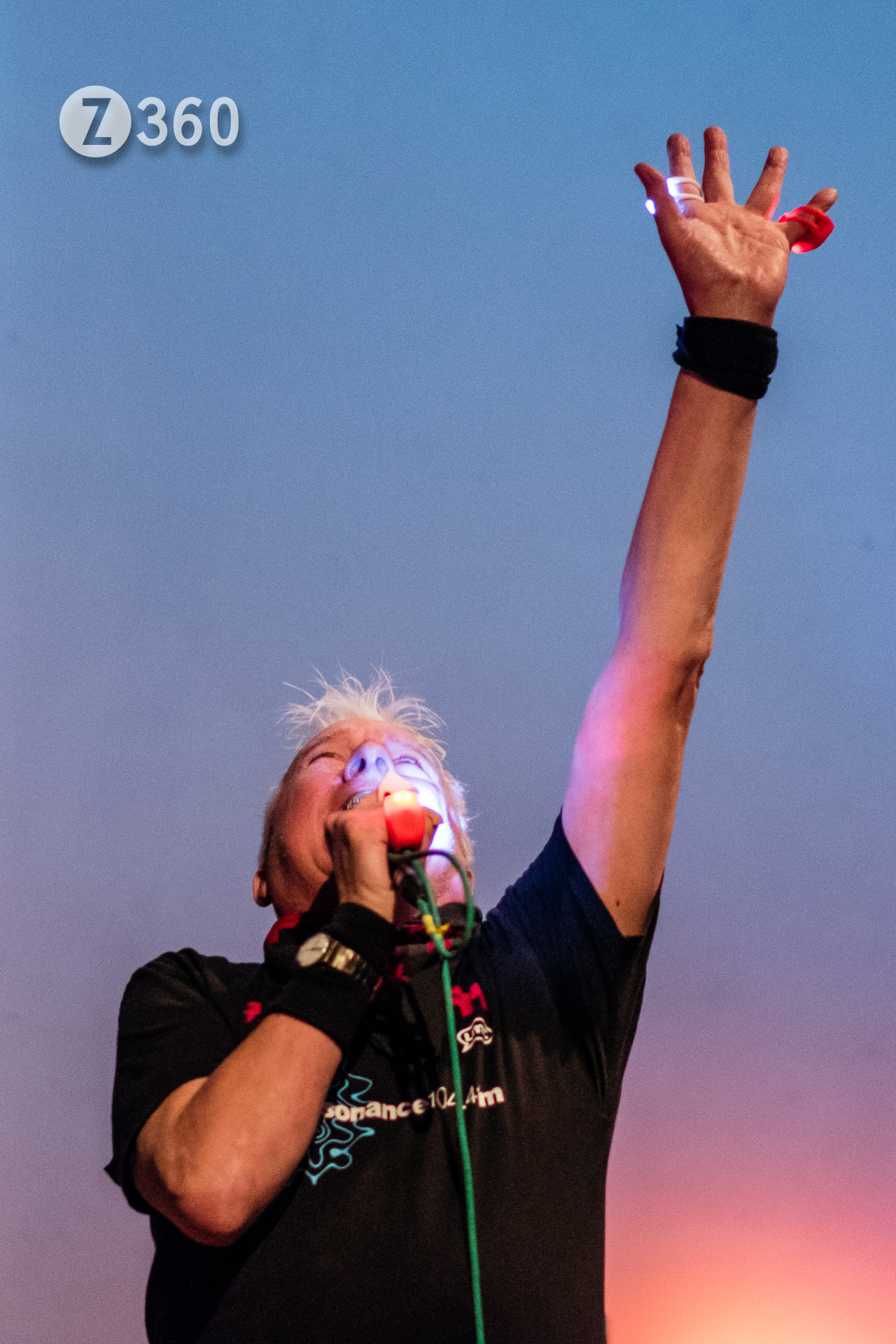
Spizz Energi at iKlektik, Lambeth
AF-S NIKKOR 85mm f/1.8G – 1/250sec, f2.0, ISO3200

At events when I am a bit further away I use the AF-S Nikkor 85mm f/1.8G, which becomes a very fast 130mm lens on DX. This extremely sharp lens sits well on the D5500 and only weighs 350g. Another FX lens I have used extensively is the tiny Fisheye Nikkor 16mm f2.8, which requires manual focusing, but does give a unique picture angle of over 100 degrees. For general travel and video usage the AF-S Nikkor 24-120mm f/4G VR lens is much heavier, but still quite manageable and becomes a powerful 36-180 lens without any FX corner fuzziness.

John Landor Music in Motion

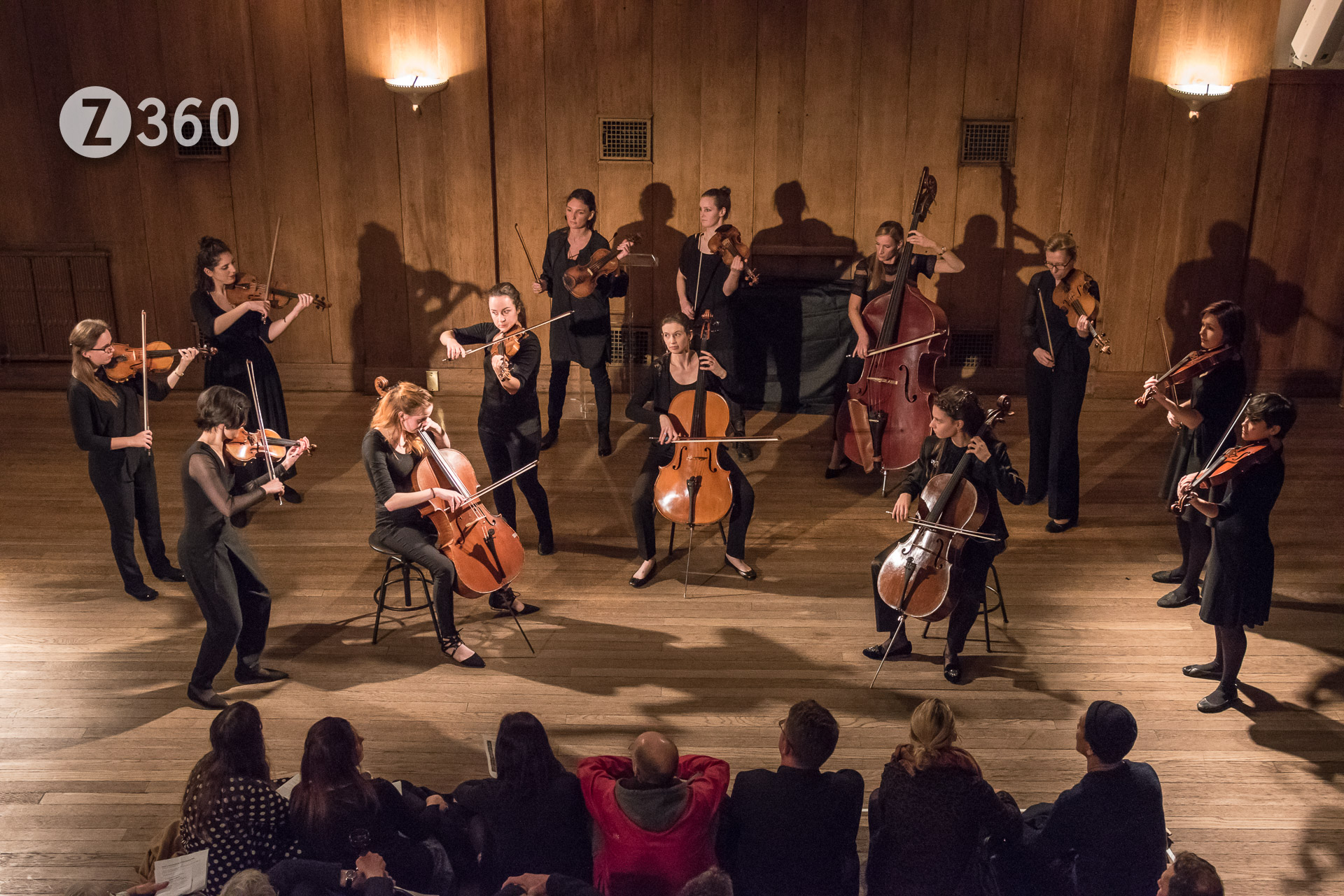
John Landor Music in Motion at Conway Hall, Holborn
AF-S NIKKOR 24-120mm f/4G – 1/125sec, f4.0, ISO3200

To put all this in perspective the D5500 is a remarkably light camera (470g) with an excellent grip. While lacking a few bells and whistles, in particularly a discrete aperture dial, you soon get used to this and I have yet to find something the camera can’t do once you are familiar with the menus. The touch screen is also remarkably useful and can be used to set focus. It competes well with mirrorless cameras, being smaller and much lighter than a Nikon Z6 or Sony A7, and while the Fujifilm X-T30 may be a little smaller it does not have a proper grip and is at least twice the price. I prefer to handhold my camera and do not use a strap, which inevitably gets in the way and makes shooting less flexible. If you really want a light camera choose a Nikon D3500 which only weighs 365g, the lightest DSLR ever. It is the same basic design as the D5500 with the same sensor, but has only 11 AF points, as opposed to 39 on the D5500. I would not recommend it for video since it has no flip out screen or headphone/microphone port. It does represent excellent value, the results for stills should be as good as cameras costing four times as much.

Irene Serra

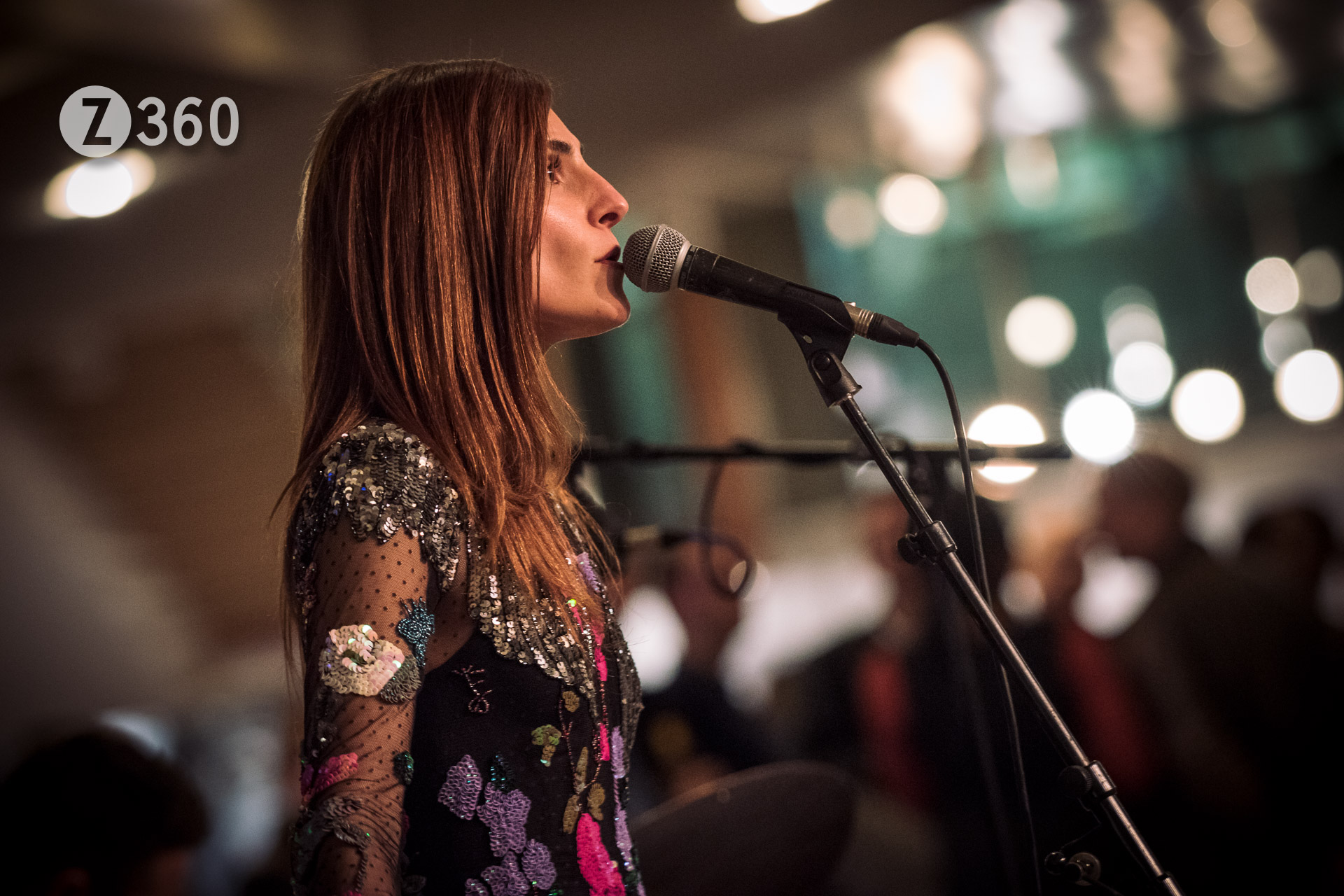
Irene Serra at Royal Festival Hall, Waterloo
AF-S VR NIKKOR 70-200mm f/2.8G – 1/200sec, f2.8, ISO2500

So to conclude my bargain camera would be a Nikon D5500 with 18-55 kit lens, currently available for £450. If you never use video and want to save more money try a Nikon D3500 with kit lens, about £315. The kit lens is usually heavily subsidised, you might as well purchase it since it is the only way to get a cheap wide angle on DX cameras, and they perform well enough these days. Next stop is the 50mm lens, which you can find for £150, or less second hand. If buying older lenses remember only the post 2000 G or E lenses with no aperture ring will autofocus on these cameras.

_1D82796

All pictures were taken as Raw files and processed in Adobe Lightroom.
Here are some more examples of full frame lenses on the D5500:

Trevor Watts, Peter Knight, Veryan Weston at Cafe Oto

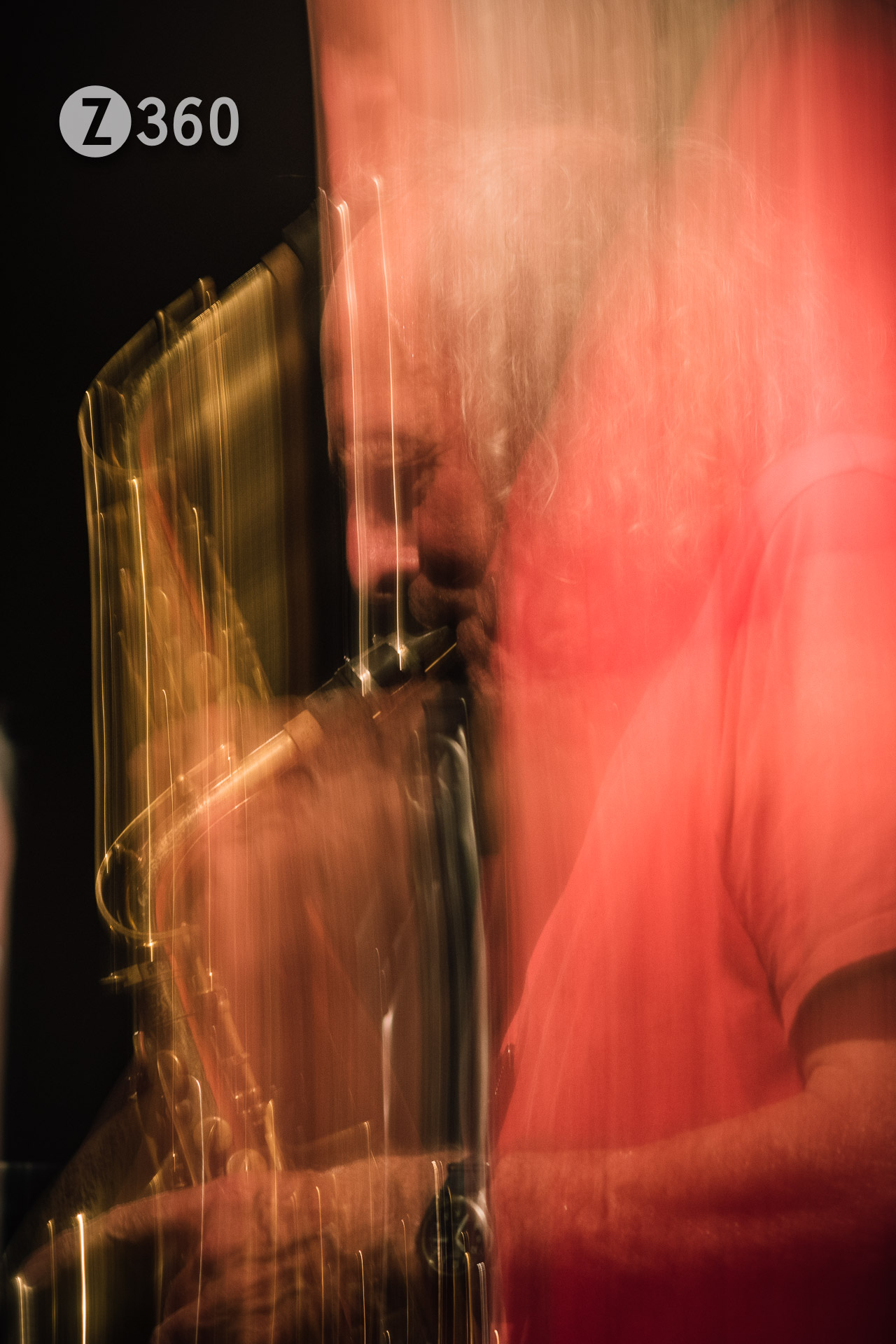
Trevor Watts at Cafe Oto, Dalston
AF-S NIKKOR 85mm f/1.8G – 1/2sec, f4.0, ISO200

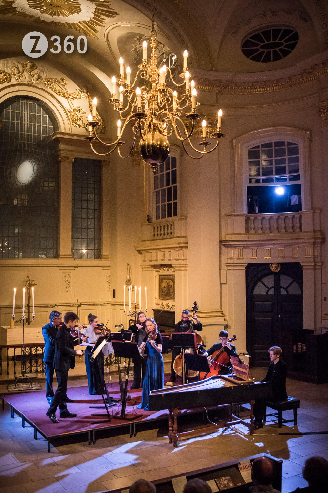
John Landor Bach Recital

John Landor Bach Recital at St Martin-in-the-Fields, Charing Cross
AF-S NIKKOR 24-120mm f/4G – 1/125sec, f4.0, ISO3200

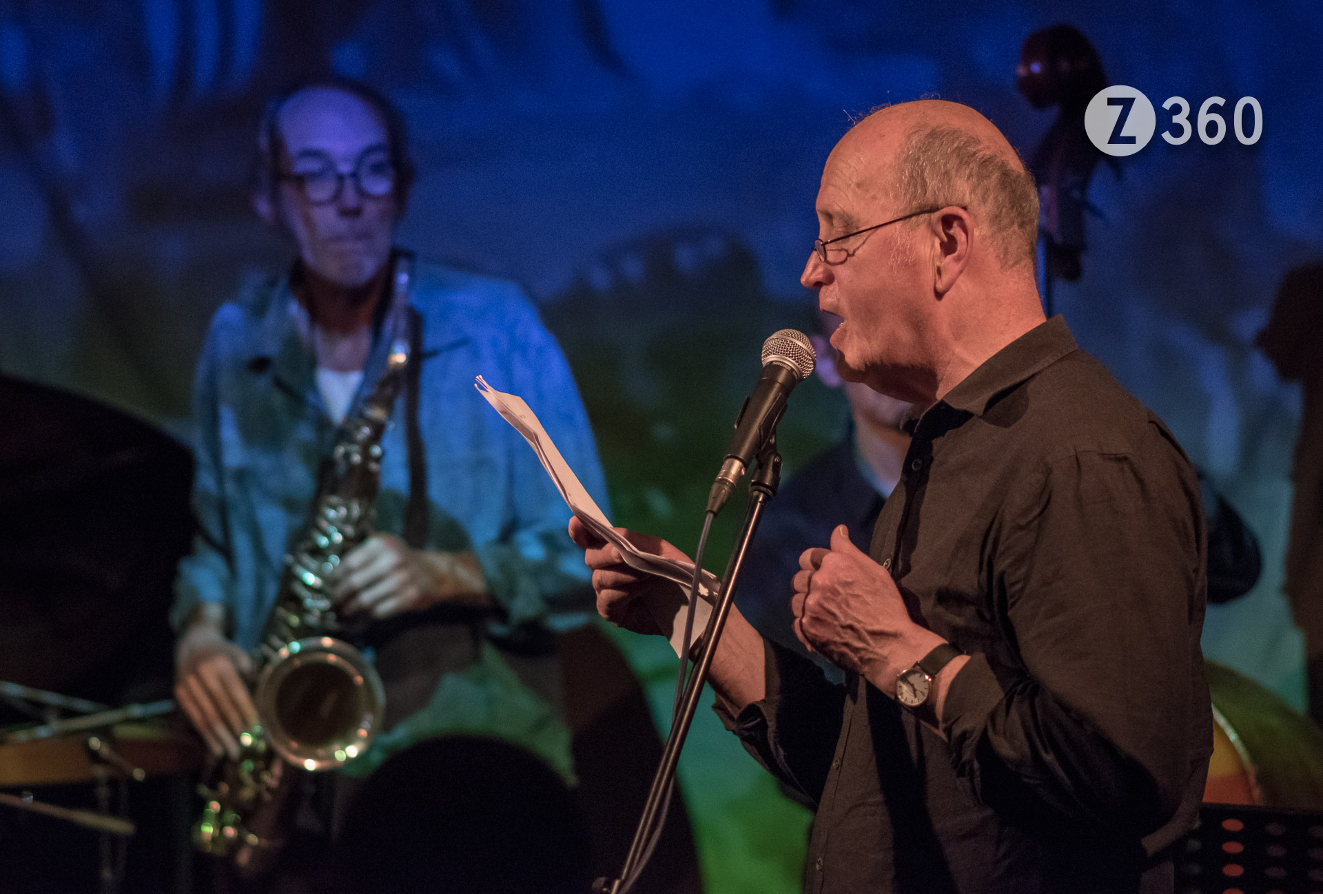
Iain Sinclair

Iain Sinclair at Cafe Oto, Dalston
AF-S NIKKOR 85mm f/1.8G – 1/200sec, f2.0, ISO3200

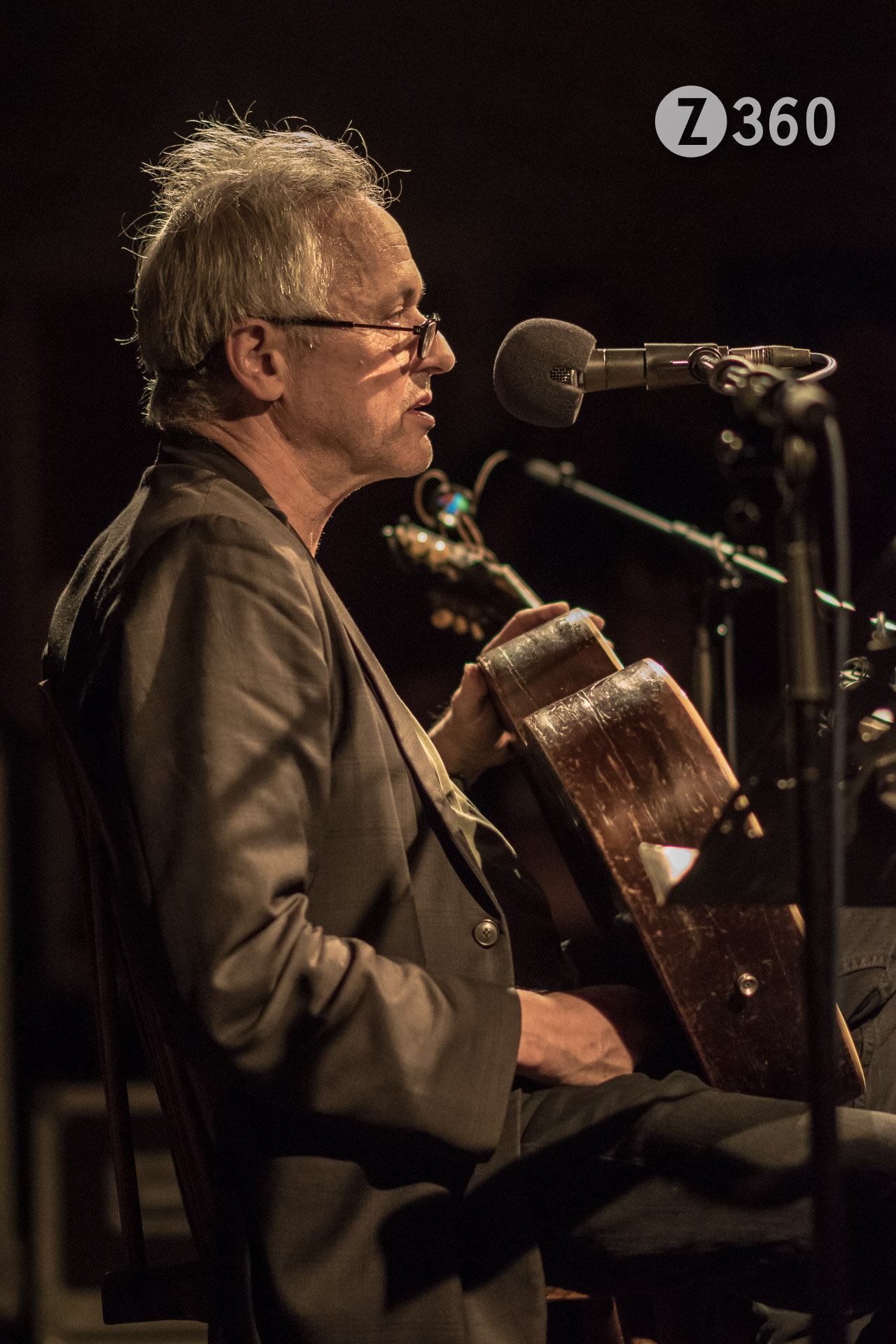
Marc Ribot at Cafe Oto

Marc Ribot at Cafe Oto, Dalston
AF-S NIKKOR 85mm f/1.8G – 1/160sec, f1.8, ISO3200

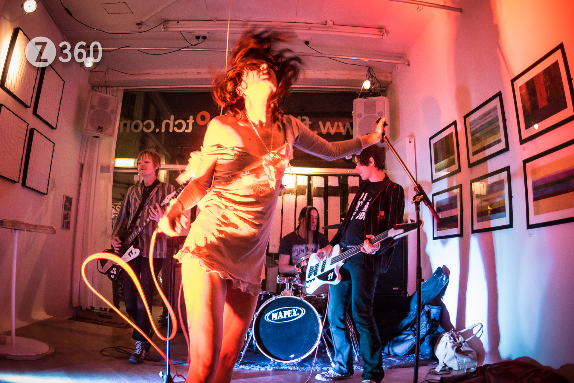
Starsha Lee at Flaxon Ptootch

Starsha Lee at Flaxon Ptootch, Kentish Town
AF Fisheye-Nikkor 16mm f2.8D – 1/125sec, f2.8, ISO3200

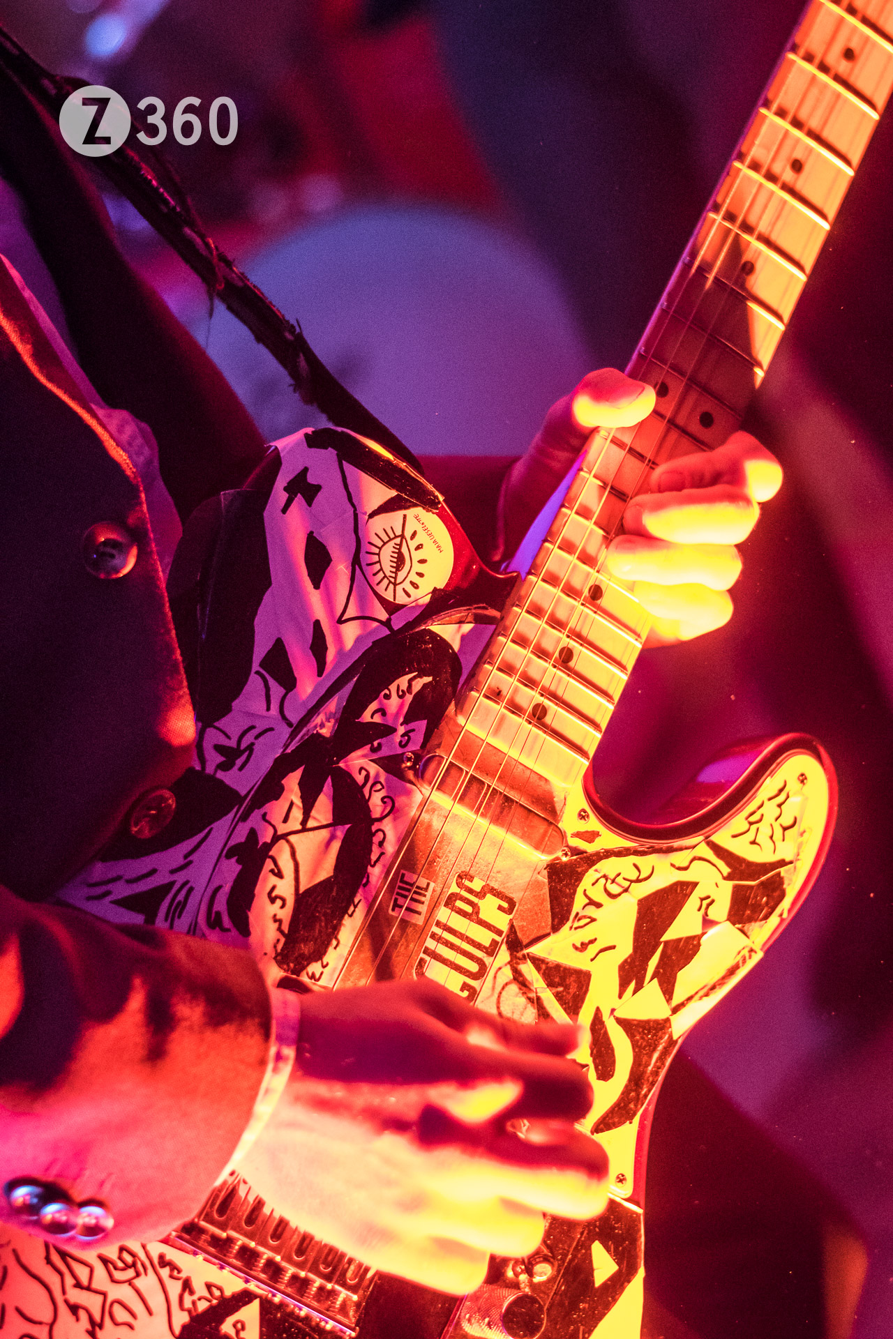
The Gulps Guitar

The Gulps at Flaxon Ptootch, Kentish Town
AF-S NIKKOR 50mm f/1.8G – 1/200sec, f2.0, ISO3200

All Photographs ©Douglas Cape z360.com


Taylor Wessing Prize : A Critique

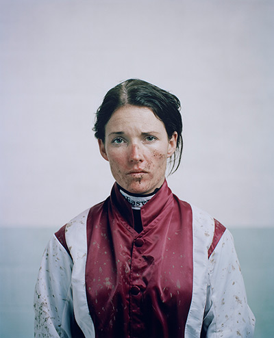
Katie Walsh by Spencer Murphy

The Prize Winner: Katie Walsh by Spencer Murphy

Well the state of contemporary portrait photography does not appear to be the healthiest judging by the show at the National Portrait Gallery. Or maybe it is the judges who are incapable of choosing examples of truly photographic images which amaze and excite us. This possibility is suggested by giving the £12,000 prize to an enlarged photo booth style picture which is badly cropped and flatly printed. Many other entries appear to be box ticking exercises to fulfil some imagined social criteria not directly relevant to the art of photography. Some pictures were parts of a monograph which do not stand up when taken out of context, or journalistic commissions featuring famous people and formula photography. The number of people either sitting on chairs or looking straight to camera is stultifying and there appears to be a strange obsession with gypsies and twins. Of course there is a photograph of The Queen, in this case a tiny and unpleasant snatch shot. In these portraits nobody is doing or expressing anything, there are hardly any actual physiognomic examinations (surely the essence of portrait photography) and certainly a lack of technical exploration. The formulaic and unadventurous nature of the Taylor Wessing Prize is demonstrated by the previous years entries which could replace this year without anyone noticing.

The exhibition was cramped (£3 for 3 small rooms) and clumsily laid out with the prizewinner hidden in a corner (halving the potential viewers) and many pictures stacked one above the other making viewing difficult. The lack of respect for the skills of photography was demonstrated by the fact that there were no technical details whatsoever.

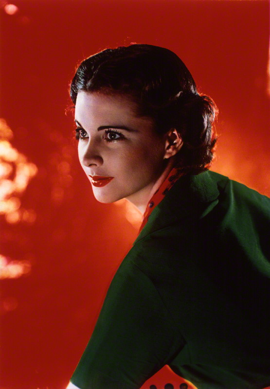
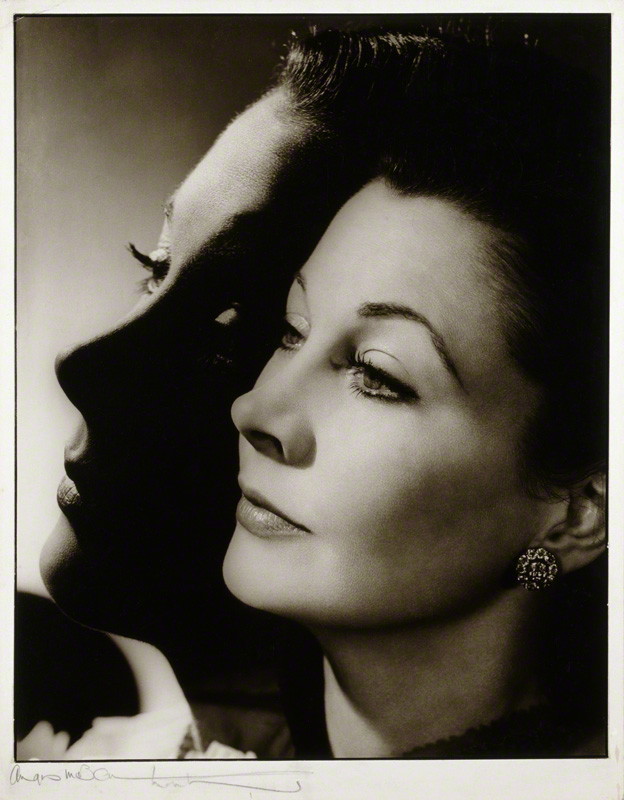
My criticism of this show was reinforced when I nipped upstairs to see the free Starring Vivien Leigh: A Centenary Celebration exhibition, featuring 2 portrait photographs by Madame Yevonde and and Angus McBean which are truly photographic images and far superior to anything on view downstairs.

NPG P742; Vivien Leigh by Madame Yevonde

The Madame Yevonde portrait was taken at an acute angle in vivid dye-transfer Technicolor in 1936 and was more daring in its posing and use of colour than anything on view in the 2013 selection.

NPG P62; Vivien Leigh by Angus McBean

The Angus McBean portrait is a monochrome double exposure print from 1952 nearly in silhouette, both more technically adventurous and revealing than any of the contemporary work. Surely the judges could have found some equally strong work in 2013?

PS “Fabio” did raise a smile..

Postscript 2016
The Guardian says the 2016 £15.000 winner is “An apparently simple and straightforward picture of a boy in his school uniform”. The Judges say “something beautiful out of the everyday”. Oh yes the Judges have chosen another incredibly boring photobooth shot !

Marc Ribot Trio at Cafe Oto

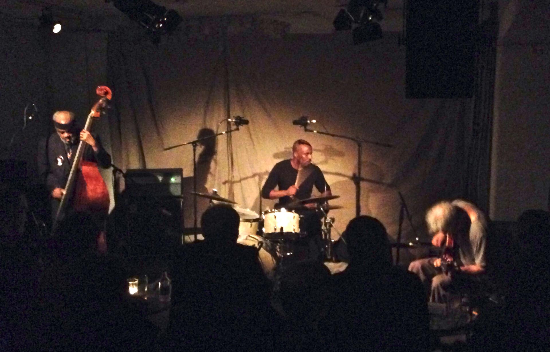
The Marc Ribot Trio dropped into a packed Cafe Oto with Henry Grimes on acoustic bass as the NY history man of 60s free jazz, and on drums the muscular Chad Taylor from Chicago. Just visible in the corner on his chair was a middle aged workman in a dirty T shirt, his body folded over his guitar. Marc played 2 seamless symphonic sets, with nary a word, just a few applause breaks, especially for the septuagenarian Henry. The music was free jazz but encompassed show tunes, cartoon breaks, marching songs, pop riffs, angular funk and metal shredding runs. It was a capsule history of 20th century American popular music, of which more later…

Ribot_5809

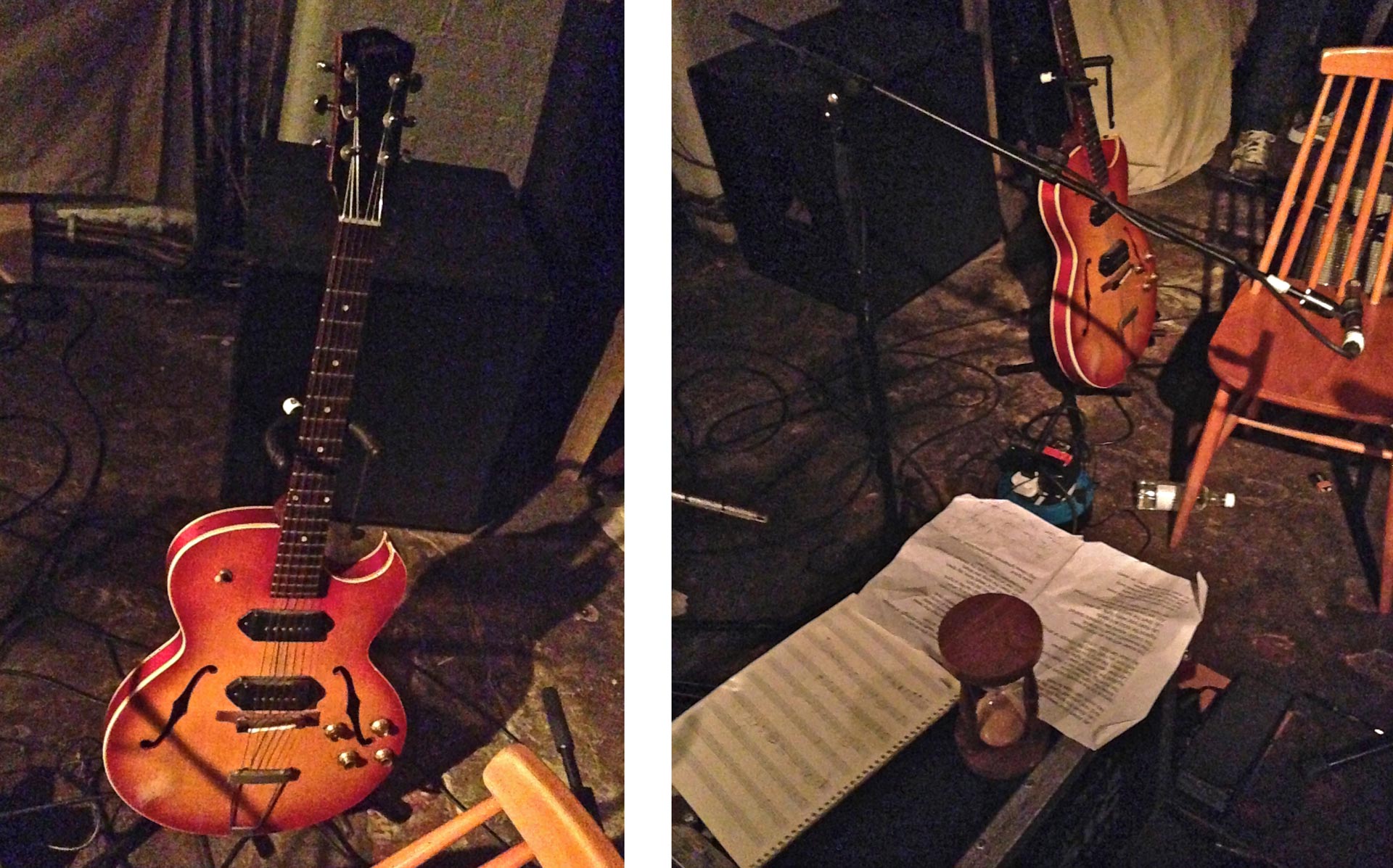
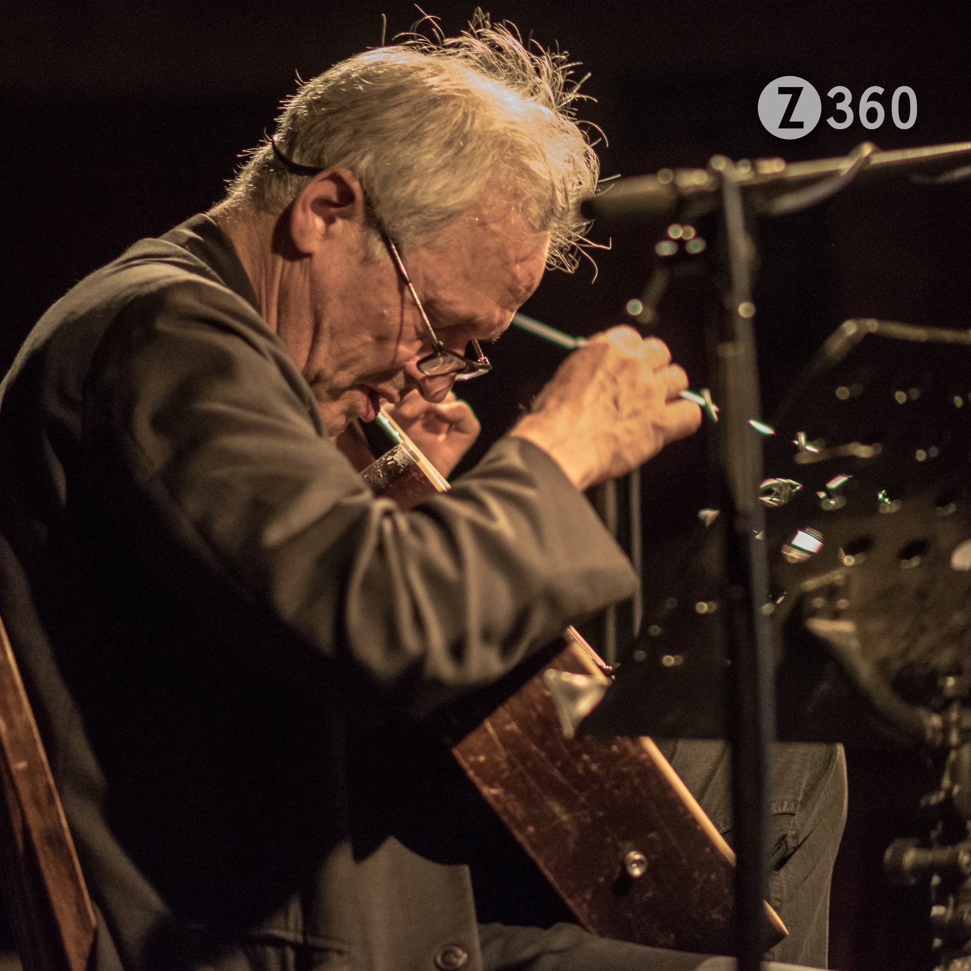
Marc Ribot plays a Gibson ES-125TDC circa 1962. This is a semi acoustic thin bodied dual pickup electric guitar (famously played by George Thorogood) which he used for every guitar style known to man. He accomplished this with a unique but simple setup of one pedal and one guitar mic, allowing full usage of the electro-acoustic qualities of the guitar. For the the riffing and the metal runs the guitar mic was pushed aside, but for most of the set the guitar mic was just a few inches from his guitar allowing a unique blend of sounds, and then suddenly a lever was flicked and we were back in the prairie with a steely acoustic country guitar whispering to us. Most remarkably he leant over his guitar, his chin appearing to rest on the body, the guitar mic a fraction away as screeds of notes poured out in concentrated flurries – completely hunched over but his arms flying up and down the guitar. At one point you could hear his gritted breath through the guitar mic, no doubt intentionally.

Ribot_5829

During the first set we went a from classic click-clack drumbeat into what sounded to me like Gabor Szabo’sThe Beat Goes On, well it was funky and Latin anyway! Marc’s cover versions often have a very remote relationship to the original and in no time the music had metamorphosed into angular 80s Bill Frisell style jazz funk, finishing with a chomping Stevie Ray Vaughan blues flourish. A lyrical show tune began the second set echoing the smooth classic jazz of Wes Montgomery and we sped through a catalogue of American styles rapidly coming apart at the seams, at one point sustained riffing drawing applause. As the music splintered, only lightened by bass and drum solos, we heard snatches of the American songbook being deconstructed, reaching its lyrical apogee with a version of Bob Dylan’s Lay Down Your Weary Tune. Yes he sang a song both appropriate and somehow elegiac, Marc’s tremulous voice following not the vocal but the guitar line:

Lay down your weary tune, lay down

Lay down the song you strum

And rest yourself  ’neath the strength of strings

No voice can hope to hum

It felt like a Requiem for America…


Update 14 May 2019
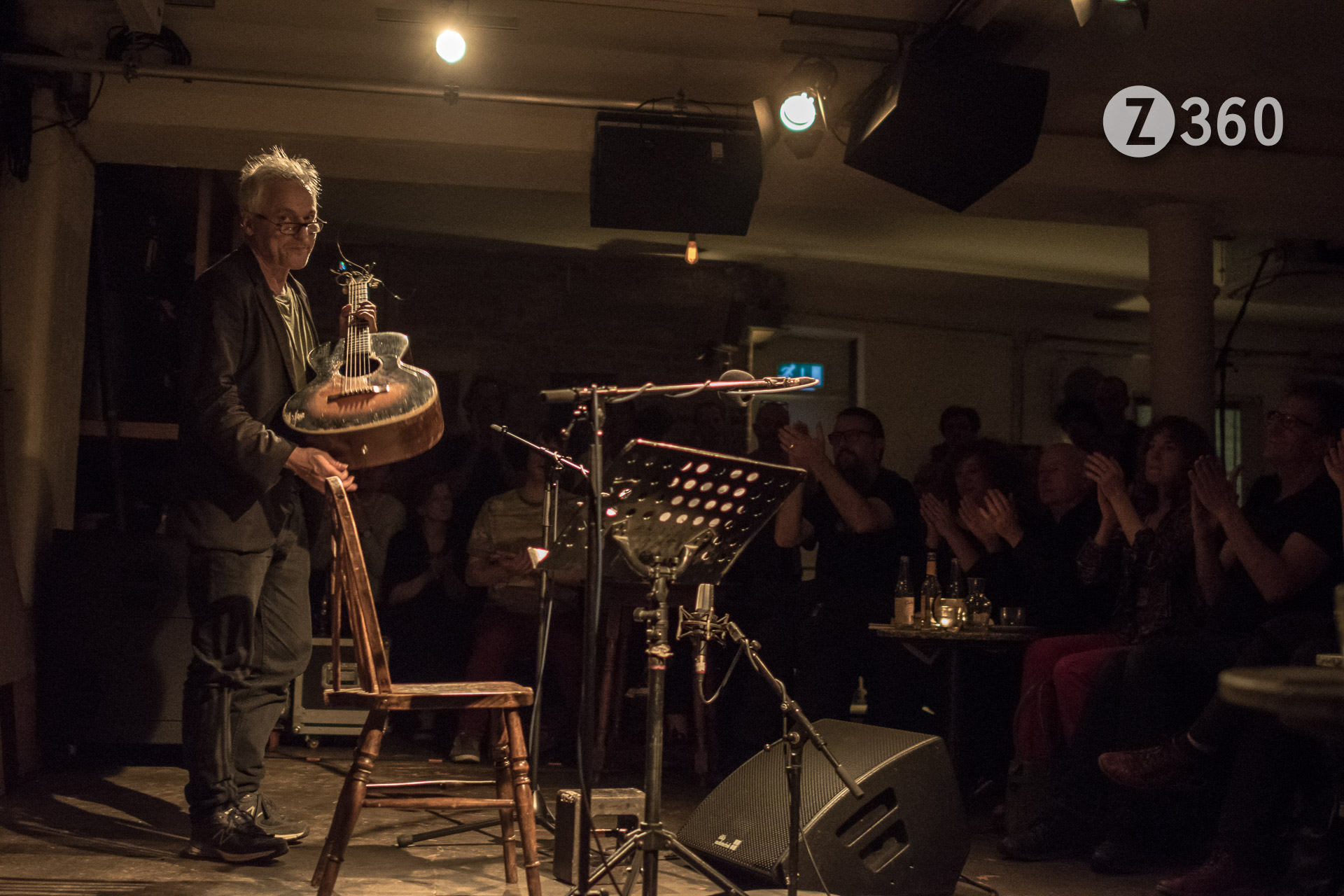
Marc played a solo acoustic gig at Cafe Oto
Magnificent and quieter tonight –

But better photos:

_DC56547 _DC56568_DC56573

Everyone loved it
Thank You

A Short History of Quicktime VR

In 1992 Quicktime 1.0 was launched. This was followed in 1994 by Windows friendly Quicktime 2.1 which, along with QuickTime VR 1.0, could play Panoramas and Objects in a discrete QTVR Player or in a browser plugin for Netscape Navigator.
In Quicktime 2.5, with an updated QuickTime VR 2.0, these items were integrated to make a free universal VR Player. Interactive multimedia had arrived!

So the Player was free, but to make this interactive multimedia you required the QuickTime VR Authoring Tools Suite which comprised of 2 huge binders, a video and lots of floppy discs. There was no GUI (graphical user interface), you had to write code in MPW 3.2 (Macintosh Programmer’s Workshop) and use Hyper Card and ResEdit. This Tools Suite cost $2,000 and could only run on a $4,000 Apple computer. Despite regular crashes (normal in those days) and a long learning curve, it all worked.

Panorama made using MPW 1997, but the Quicktime VR Player no longer works. Part of a Camden Lock Tour which appeared on a MacWorld cover CD in 1999.

It is worth remembering there was no broadband, only modems working at a fraction of the speed, and that digital cameras were in their infancy, so most projects had to be digitised from film, often using Photo CD.

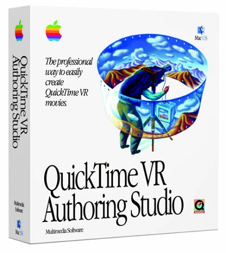
In late 1997 QuickTime VR 2.0 Authoring Studio with a full GUI and batch mode was released for $500, bringing VR into the mainstream. The Authoring Tools made cylindrical panoramas, object movies and tours with internal and external links. For many years this programme was the default panorama maker, despite later competition from RealViz Stitcher, Powerstitch and VR Worx.
Quicktime was steadily updated, although Quicktime 4.1 notoriously re-numbered all your hotspots so you never actually went where you had intended. At the same time other panorama players appeared, unfortunately including the litigious Interactive Pictures Corporation (IPIX) who threatened to sue anyone who distributed software to create 360 degree panorama images, including the software developer Helmut Dersch and also Live Picture’s PhotoVista. IPIX, which charged $25 per panorama created, were to go bankrupt in 2006, hoist by their own petard: patent violation.

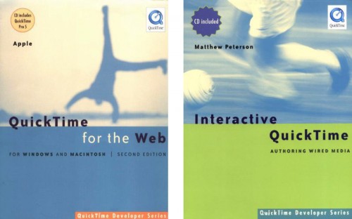
Apple supported Quicktime VR with special Showcase pages and a vibrant Apple QuickTime VR mailing list. The flexibility of Quicktime VR allowed the creation of true multimedia experiences. These 2 huge tomes in the Quicktime Developer Series illustrate the potential power of this technology.
Perhaps inspired by Helmut Dersh’s Panorama Tools, in 2001 Quicktime 5 introduced the spherical (360ºx180º) panorama player which we know today. By this time Quicktime supported mp3, Flash 4, streaming and “wired” movies. These wired movies allowed an authoring application to unlock the power of Quicktime, of which the prime example was Livestage Media Pro, allowing you to skin Quicktime and integrate different media and players interactively. Sadly this example no longer works as it did from 2004 to 2015.
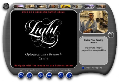
Console Tour with panoramas, video, audio, text, hotspots, controls

With the advent of spherical panoramas new software appeared such as PTMac, IBM Hot Media, Cubic Converter, PhotoWarp and finally PTGui, the current stitcher of choice. Apple never updated QTVRAS (QuickTime VR Authoring Studio) to stitch spherical images or run in OSX except under emulation.

During the early days of Quicktime VR a large amount of effort was spent persuading PC owners to download Quicktime, so they could view the media. This problem evaporated after Apple launched iTunes in 2001 (after buying Soundjam) and in effect Quicktime became the de facto music player. It was all looking rosy, but in retrospect it was at this time that Apple started to lose interest in Quicktime VR, and now iTunes can now no longer play interactive media.

With the advent of Quicktime 7 in 2005 the writing was on the wall when Flash support was dropped in version 7.3 along with several other interactive features due to “security concerns”, breaking many interactive projects. In the same year a very smooth Open GL panorama player called Cubic Navigator was launched using the latest graphics technology, but Apple did not respond. Since Quicktime 7.5 in 2008 the feature set has not been updated apart from security and compatibility updates. Quicktime 7.6 is now an “optional install” on Apple computers. It should be remembered that Quicktime 7 in the Pro version ($30) is a very powerful and flexible movie editor and compressor using the the same codecs as Final Cut Pro Studio ($1,700).

In 2009 Apple dropped support for Quicktime VR with the launch of Quicktime X, which does not play QTVR or edit movies, despite claiming it was “ideal for any application that needs to play media content”, and that it would “advance modern media and Internet standards”. In doing so they handed over the multimedia baton to Flash (now the default panorama player), their alleged opponents. Apple’s eventual response (link now removed by Apple) was an HTML5 player which was an insult to the rich tradition of Quicktime VR. It was an ignominious end for the very technology Apple had invented and promoted so strongly.

So try making this today, it might be possible in Flash using KRPano, but in 1999 we had a cool GUI in SoundsaVR to edit the multiple overlapping loops. This panorama, only 1.2mb so it could be delivered over a modem, was a big hit at MacWorld 1999.

Echo City with Sound Loops, using SoundsaVR

Coda
Of course interactive multimedia plays on, with incredible gigapixel panoramas in Flash and swishy cool HTML5 panoramas on the iPhone and iPad. However to make these we are back hand coding in XML, while the wired possibilities of Quicktime have been abandoned. Quicktime VR still functions (in some browsers) and Quicktime 7 is still available, but for how long?

Update 8/12/15
Today Apple finally destroyed their own creation, Quicktime VR.
In a “Security Update” Apple silently removed the Quicktime Plug-in which played Panoramas.
Apple stated “If you’re using the legacy QuickTime 7 web plug-in to display panoramic images, use an HTML5-based panorama viewer instead. Search the web for a panorama viewer that doesn’t require a web plug-in.”
Appallingly disingenuous since there is no HTML5 player that can play Quicktime VR without the author re-encoding the original panorama. Shame on you, Apple.

PS
To restore the Quicktime VR plug-in on OSX
Go to Library/InternetPlug-Ins
Move these two files from the Disabled Plug-Ins folder to the Internet Plug-Ins folder:
QuickTime Plugin.plugin
nslQTScriptablePlugin.xpt
Hurrah !

All VR examples © z360.com

Thanks To :
Tim Monroe
Ken Turkowski
Joel Cannon
David Palermo
and many others on the Apple QuickTime VR team